Changed animation of green stickman a bit:
scene10-zel.sifz (21.3 KB)
Scene 8: mediafire.com/?sharekey=6f51 … b9a8902bda
This one’s in no way finished, but I’m throwing it here because I’m sick of working with it for now. (Sorry about that - but synfig’s acting really buggy all of a sudden, and editing waypoints is a bitch. You’ll notice the arms are all spastic and rubbery, because it keeps trying to rotate the ducks the wrong way around.)
I cut it down to 5sec to accommodate for the fact that scene 10 is 1sec too long.
EDIT: That would be FROM 5sec TO 4sec.
This one’s slightly better.
evilkillerfiggin:
Hi! I imagined scene 08 to happen with a bit deeper perspective. Something like this:08.zip (360 KB) But this still need to be tuned…
Attempt to make Morevna’s finger wrap Ivan’s hand:
04-4.sifz (159 KB)
Drop the sifz file in the folder that contains the images you have modified the last time.
-G
Here’s an example for the motion of nail.
Notice the green invisible guide layer for the finger. Nail is comes from behind of the finger.
04-finger-example.zip (144 KB)
[size=150]Character layout: Ivan Tsarevich.[/size]
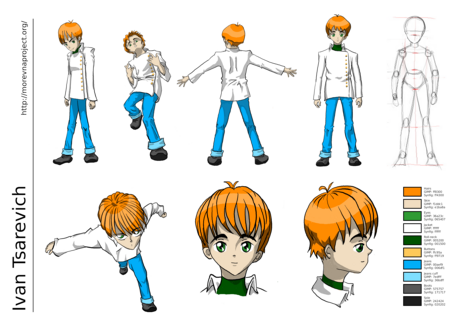
Very nice character sheet, although I do dislike the sideview of his head. But then again, the moving poses (first row, second picture from left and second row, first picture) really strike me. They are made very nicely! 
Devilly:
Thanks for your comments! Can you tell more precisely, what you don’t like in the side view - maybe we could redraw it considering your suggestions.
Hard one to explain, but I’ll try:
- the chin-line isn’t exactly perfect (should be a little less horizontal and also with a little curve)
- the upper part of the head really looks gigantic, although I don’t know why I have this feeling much more with the side view than with the front view
- the upper part of the nose is too much to the back
Let me know what you think!
Devilly:
Thank you. I agree, what side view should be reworked. Also I don’t like the front Ivan’s image above side view - figure looks too fat.
Hey everyone. I am banor. For now I will be contributing to the Morevna Project. I have watched the project loosely for a while now, and I am wanting to contribute.
I am an artist, writer, musician, etc. God has given me many talents, all to His praise. You can find some of my various links:
minosafilms.wordpress.com/
artislight.deviantART.com/
forestquest.org/
As for graphic art, I draw, do some 3D modeling (experimenting with Blender,) use GIMP, and Inkscape, and like innovative, crazy ideas.
That’s just a piece of me, and now to get working on this project.
Best wishes and glad to be on the team.
-b
Hi, this is an RFC for a soldiers’ uniform and general looks.
Please share your thoughts.

PS. This is my first post. Nice to meet you.
Some nice work there, wall[e]! They look punkish, though. Even though these are soldiers are the bad guys (excuse my simplistic terminology) they look quite bedraggled. I like the work though.
An idea: what about having an older soldier, say around 50, who has rugged features, worn face (as though from pain, drugs, very hard and serious life,) and has a prominant scar on his face (that’s been done before, I know.) He is the oldest and most hardened by years and command, so he stands out as their leader. That’s an idea.
If you want I can sketch up some suggestions.
These look great to me. A suitably motley bunch. What’s next, a character-layout sheet for each, like the one for Ivan?
When it’s time for the character design sheet we should refer to the soldier’s outfit that has been designed.
@wall[e] - do you want me to draw up some ideas as well?
Sure, let’s show them to Zelgadis and he will tell me what to do
since he hired me to do all these with some pr0ns.
wall[e] - alright. I drew up a facial design for the scarred commander, but it didn’t turn out the way I imagined it. I will likely post it anyway. Will have to do all that tomorrow.
Earlier when I was considering contributing to the Morevna Project, Zelgadis told me that making six soldier designs was something that could be done. My indecisiveness, etc., caused delay so I was unable to work on that.  Oh well, your work is quite good. I like the ones with the sunglasses and glasses (especially the one with glasses.) I also really like how your facial designs show quality, as though you’ve drawn and worked with manga before (which you probably have,) and even though your drawings (of the six soldiers) are not in the manga style that the Morevna Project seems to be in, I like them. The smaller eyes and greater realism highly appeal to me over the exaggerated styles of some popular anime (huge eyes, whacky expressions…) I prefer Miyazaki.
But those are just my thoughts. Later!
banor, I like Miyazaki too. And for the style … I don’t know if I can really do everything in
‘Moe’ way… for female characters it won’t be much trouble. I practiced drawing female
characters from manga and male characters from comics, and try to blend them all
to some point to get my own style… now you can see my problem. So I think I need
more time to do experiments with it (and hope I won’t be with it too long or it may
affect my current stlye which is required for my own manga) I think one way is to
start from current Ivan design… hmmm. Let me think about it!


I am still not sure about the boots, today I went to see a movie so I tried to flush some
ideas down the paper during my waiting… well… I don’t know if I really like it yet…