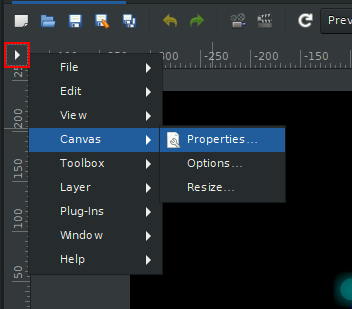
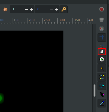
So it combines old “Menu” functionality (left-click) with new “Lock Guides” (right-click) which I am not a fan of because it’s not very intuitive. You can read my reasoning in the linked PR.
I suggested in the PR discussion that we move the icon here along with the rest of the buttons related to guides:
I also agree with your reasoning. Separating them is a bit more intuitive. Also, becuase the buttons there do similar functionalities, so users would expect it to be there.
I’ll suggest removing the menu all together as we already have a menu bar, and leaving the lock guides at the top left corner of the canvas instead of adding it to the toolbar.
I don’t remember why it was added in the first place but there was a reason. Some macOS issue? Basically, the menu button was added to address some specific issue but I don’t remember which one…
The disappearing menubar is very common for people who click accidentally to hide it (enough to have the “menubar” tag), some even delete their profile when they don’t know how to solve it.