List of updated icons:
1, Skeleton Layer
![]()
2, Image Import Layer
![]()
3, Canvas
![]()
4, Interpolation Types
![]()
![]()
![]()
![]()
![]()
![]()
5, Stroboscope Layer
![]()
=======================
List of updated icons:
1, Skeleton Layer
![]()
2, Image Import Layer
![]()
3, Canvas
![]()
4, Interpolation Types
![]()
![]()
![]()
![]()
![]()
![]()
5, Stroboscope Layer
![]()
=======================
Sound logical to me.
-G
Howl, I WIN! 
icons for skeleton & image import layers, the canvas icon is replaced with old import image layer but in green color (Green is the traditional color of canvas related element in Synfig Studio, green ball, green folder etc…)
The dog used in Image Import Layer icon is copied from Genete’s artwork.
![]()
Woof-woof!
Interpolation type icons improvement
That looks much better - it’s a huge improvement having the interpolation icons smaller in the Parameters Panel.
todo: update five Interpolation icons (plus an undefined type[1]) in time tack panel. they are drew in code directly.
more information regarding interpolation/waypoint icons please refer to the wiki page
[1]Undefined Interpolation Type

Hi Does anybody know about the original idea of Ease In/Out icon, its dark outline is not like other icons, it is opened .

My proposal in the above post is using closed outline as other icons.
![]()
With opened outline, the icons remind me a stream flow.it is a quite nice idea for WayPoint. But there is an exception, the TCB will be a challenge to use this concept. The other types would be easy to adopt it.
I like the new design.
I think that the icons are fine with your latest version. The closed curve for the Ease in/out makes it consistent with the rest. BTW, there is a little filling gap on the lower part of the ease icon.
-G
Ok, thanks for feedback. Let me start to dig the code for those icons live on time line.
fixed now.
I’ve been missing Boolean Operation Tools for 3 years now. ![]()
1, What is it
en.wikipedia.org/wiki/Stroboscope
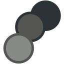
2, How does it look like
Google Image, Keywords: stroboscope animation
3, the Proposals
![]()
What about something like this?

nice, more recognizable and the bouncing ball is famous in animation world. Thanks Genete ![]()
i like both of them at full size, but when resized at 16x16 (normal ui size) it’s not so clear
maybe reducing number of petals in jcome propo,
maybe augmenting size of circle in genete (if have tried whitout nicer result)
for memory : another discution about stroboscope icon
strobo:ya:
Bouncing Ball Trial1
The import image layer is my favourite so far! Somehow Synfig and ducks just go together!
thanks ![]()
update waypoint icons on time track panel by applying tango color palette,
update ease interpolation waypoint icon to have same style with others.
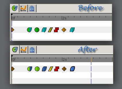
as you can see, the icons are not smooth at all, we have to wait till one day all widgets of synfig studio be ported to cairo engine.