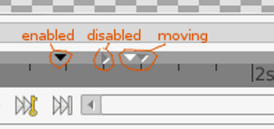
Time Bar =
[Scrollbar …] +
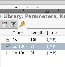
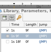
[Keyframes list bar …] +
[Time slider …] +
[Scrollbar …] +
[Current time widget, framedial, keyframedial, keyframes locks, animate button ] +
[Status bar, etc…]
To save vertical screen space, can we combine [Status bar] and [Current time widget, framedial, keyframedial, keyframes locks, animate button ] ? and do we have any solution to reduce two of scrollbars?
how about the Gimp way? I updated the mockup by adding zoom widget on status bar, it is logical that zoom of document belonging to status. And it would really nice if we finally implement shortcrust system, so that this kind of frequent operations would be easily accessed by keyboard shortcrust. So we dont need put more and more “Useful” functionality into UI by hard coding. yes, this goes to far away from this topic, but I need to keep this in mind
XD Actually, it is already quite good-lookin. But I kinda dig that “Menu” and “Play” buttons (not that I actually use them, since I always use “Preview”, which is much smoother comparatively).
Hi Zelgadis,
I am currently coding on std. menu and button bars implementation, and this Timebar re-arrangement is postponed or will be canceled since it will be removed from canvas window later in new ui design. We shouldn’t take too many spaces for Synfig Sutdio UI widgets itself, instead, the more space we return to animation artist, the more satisfaction will be achieved. do you agree? We have no any reasons to have duplicated time widgets on UI (on canvas window and time track panel).
Wish me good luck on standard menubar and buttonbar implementation.
Every time I look at one of jcome’s UI mock-ups, I can’t wait to see a cartoon made using his characters. In fact, I’m just as keen to see one of jcome’s cartoons as I am to see his new UI!


