Wow! Has it really been a year since our last release? Is it really September already ?? I guess so. Time for a new release, and for that, we need a new splash screen to differentiate it.
Same rules as last time -
I’m thinking it should be a still image, just in case the code isn’t ready for an animated one, and also because studio doesn’t start that slowly.
No particular theme or size, let those artist imaginations flourish! It should probably include the words “synfig studio” and maybe include the logo or remind folks of the logo. You may want to search through the IRC/list/wiki/etc archives and find a joke or recurring theme for inspiration. Perhaps try to keep it smallish - around 300x400 like the gimp one.
The chosen splash must be either public domain or licensed under the GPL-2 (with “or later” option). It must also come with full source code - so we can modify & render it if needed. It must all be created in synfig, no dependencies on external images created in other applications, nor special fonts.
I’m assuming we’re targeting the version to be 0.62.0 in case you want to incorporate that… (Genete, correct me if I’m wrong).
Questions, suggestions, etc are welcome. Happy drawing!
Not completely happy with the text though. Would like to fiddle a bit more with that part.
Also looking at the image now makes me realise that I’ve got a huge colour difference between my laptop monitor where I made this, and my workstation screen. Looked much more grey at the laptop but here it’s all green…
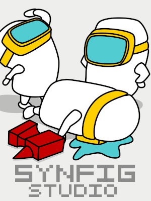
(so far I like the most rylleman’s lighthouse and zenoscope’s little men. )
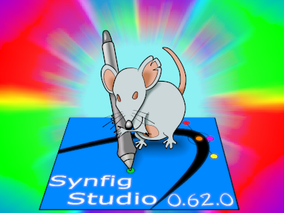
My entry is pretty dull, but huh, I had this in mind and I had to draw it to get rid of it
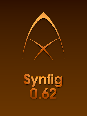
Cheap gold effect and simplified logo and … well… there should have been a cat and a duck, but they were so small that it was ridiculous. 062_simple.sifz (23.1 KB)
 (Hope it uploaded correctly…)


 I like the lighthouse too, and Rore’s logo is very stylish.
 but all are v-good.