wait a sec, nevermind. I am able to access the link now. Am I supposed to refer off of these images for my expressions of Ivan? I haven’t gotten to working a full version of that yet… even if I do quick, whacky sketches, it’ll be better than never.
Other things I want/need to do as well, so, ciao,
-b
P.S. Check out the new movie “Fireproof”. It is a very good movie!
(btw, Fireproof doesn’t have anything to do with anime or open source, but it’s still a good movie - not as high-budget as other films, but in the end the story is what really counts.)
sorry for so many posts, but just some quick news you may already know…
New version of GIMP (announced recently,) version 2.6.0 - see gimp.org/
New python script for Blender, to help import images for cutout animation. Looks very helpful for that type of animation: blendernation.com/2008/10/10 … ge-import/
Alright… some aspects of the soldier seem disproportionate, such as: the legs seem too thin near the pelvis area (the protective/stylistic tiny shorts that the soldier’s wear over the pants seems too large, or the legs entering it too small.) His shoulders also appear too broad. Those are some notes that, if fixed, would increase the realistic appeal of their design. On another note: the art style seems simplistic at this point. Perhaps we will add dynamic details later. One thing that would help your outlining of the soldier would be line thickness (large and small strokes interpolating to eachother, like inked brush strokes.)
Great! Glad to hear… remember, their dogtags are like universal ID cards, in place of: credit cards, ID numbers, access cards, regular dogtags, etc., etc. ;D
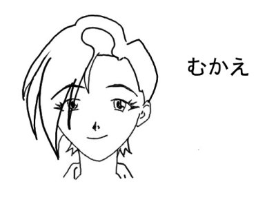
A drawing I did recently (but hadn’t gotten scanned, etc. yet)
By banor at 2008-10-13
“Morevna at the end.” Morevna crying out in pain as the needle is removed, the Man in Black stands silhouetted in the background, holding the needle; in the background their is also the great struggle between Ivan and his vile foe. Morevna lying dead (sleeping?) … large drawing of her: waking when Ivan comes to her side, the tears staining her face. Top of picture: hooded man is The Man in Black, Death himself. This is a conceptual drawing of what he looks like. Notice the colored tatoo/glowing flame designs upon his bald head. He is depicted as a strong, aquiline, warrior monk rather than a wise, ancient sage of another era. (Note: Man in Black (Death himself) could wear a wooden (or metallic) Christian cross around his neck… I do not want to contradict theological views by having him wear a cross, but it’s an idea at least.)
Guess that’s all for now… I’m looking forward to completion of this project, even though it may take years at this rate.
Yeah, forum is for discussions too, but for random discussions.
Just imagine: no one have time to fix all your suggestions. Time passes by and someone wants to improve the concept, so he starting to looking for suggestions were made for this task. If those suggestions located on the forum, then that person should look through the whole forum thread (which is already a 9 pages now) and find them. Tough. If comments placed in the wiki it’s easier to locate them.
It’s OK to post in text. But drawings also appreciated.
About the uniform concept. In general single task could be developed endlessly. But we didn’t have an eternity, aren’t we? So we should end up at some stage, to proceed to next task. Those pictures do the main thing - they show how soldiers dressed and look in general. They shows the idea for artists to follow. And that makes them to be considered as usable.
We need to make concepts at some level. They could be unperfect at some, but should represent the idea. They could be improved later - that’s why it’s good to write up the critique at the place where it could be easily found. But if those tasks aren’t done at all - they are blockers. That brakes the work.
About details. As genete mentioned: “remember, you need to animate it”. And he is right. Oooooh, I know what he talking about. I prefer to simplify a things a bit rather to make them complex. Even a vector based animation is a time consuming work. Really.
About art style and realism. We are drawing a cartoon. An anime. I don’t want to achieve a full realism - if I wanted realism, then I would made a movie ^____^. Animation have a bit different language, it could be more simplistic, but more expressive at the same time. So I like, when we could have colored hairs, wider shoulders and gravity decreasing, when characters jumps off the ground. Cause animation allows to define your own world. Yes, it could be ugly at first. But we are learning and want to end up with something, aren’t we?
The Man in Black (Death himself) is not appearing in the demo, but I mention, what I have a different image in mind about him. I imagine him like a rock-musician in dressed in a skin-tight black, with white hairs. And looks like the age of Ivan (maybe a little older).
Alright, thanks for all the info, Zelgadis, makes sense. Yes, I imagine animating vector (instead of raster) is still time consuming. I can post some to the wiki if you want - still getting used to how all this is set up and am more comfortable with the forum at this time.
Alright, you’re directing the film, so it’s up to you how you want the Man in Black to look like. That’s just my personal drawing concept I submit for him (for now.) Yes, I know he is not in the demo. Just digressing and having fun, letting my creativity rule over the task at hand.
Thanks for all your hard work. Sorry if I am being a pain with all my questions and critique.
Yes, you are right, it is anime, and the concept of a cartoon is to personify certain aspects of something, making it come alive in a new manner, as well as having the creative freedom to construct a entirely new and nonexistent world with different properties. I understand.
It’s not that we have to make it super realistic, but there is that key touch between realism and personification, one of which is consistency, another is figure (body) proportions. I know you already know this, so please do not feel that I am pressing or preaching. This is open source, where every voice counts, and you, the leader, sorts through the whole mess and helps to glue and keep it all together.
Thanks so much for all your hard work!
When I draw up Ivan’s expressions I should post it to the wiki, right?
Ah, I understand. Please, don’t afraid the wiki. Don’t afraid to make something wrong there - everything could be undone easily. For help on editing see those links:
Yes, I understand. Just noted. To be honest I like to see how various people imagine the same characters of screenplay. Your interpretation was the third. ^^ Maybe someday someone will make a completely different version of the movie with his own concept… Woops, I’m dreaming again. ^^‘’
Ha-ha, no problems! Critique is good. Just want it stored at proper place. And questions are good to - they are helping us to understand each other and what we want.
Yeah, you right - there is a border, what we should understand. But when the things are stuck, I prefer to sacrifice a realism (maybe only just for current time) in order to push project forward.
Yes, onto Ivan’s page. I will post you example of the list of expressions to e-mail.
About the length of the thread, perhaps we could create individual forums for each large synfig-based animation project that needs one? Would that be useful for morevna?
Hi!
Banor, I will answer your letter here, in case if someone will find that information useful too.
My drawings don’t have to be nearly as polished as this, correct?
Yes. This just an example of how it could be done. Drawings don’t have to be that polished - the important thing is the idea. Though, from time to time I like to try to get drawings like those. I don’t have much success in it, but this has interesting effect sometimes - it helps me to find defects in my drawings.
Do you want shading or just a line drawing?
No shading isn’t necessary. But, again, sometimes it allow you to achieve a particular effect. (I.e. shadow on a face could make a character look threatening).
How many expressions am I doing? The whole learn how to draw manga
expression sheet? Do you want me to follow that sheet verbatim or have
freedom to expand upon what I decide better conveys the feeling of emotion?
It is good to make at least half of “how to draw manga expression sheet”. Cause they are canonical.
After that completed you will need to do second iteration - draw them again, but keeping Ivan’s character in mind. How do you imagine him would smiling? Crying? Unshure? Victorious? Happy?
It will be very helpful if you will look through the latest demo snapshot, and draw those expressions what we will need there. But this is only after the canonical expressions done.
I’m not sure about that… We were used the forum whole summer and finally I see scheme Wiki+VCS as more attractive.
Of course, we could set up same structure like we used that summer for those, who are not comfortable with the wiki.
But then, I don’t see the reason why we should duplicate the wiki stuff with the forum? And who will take care about merging the stuff of forum and wiki?
Maybe setup just one new forum section, where will be a few discussion threads - one for each task? (no complex hierarchy and splitting by type). This could help to sort out the things for project discussions…
[size=150]We now moved to separate subforum: Morevna Project.
It means you could manage your posts in threads.
Please update your bookmarks. ^_^[/size]
Glad you fixed the permissions. I’ve had trouble setting up the Forest Quest forum on the Forest Quest writing group website, but in the end I figured it out. See the Forest Quest writing grou forum here: forestquest.org/forum/


 Hopefully my words will still be helpful in the end.