Modern iconset (light and dark)

Hi,

I’m happy to announce the active development of a full replacement iconset for Synfig.

As I have been documenting, experimenting and working on it for a time, there is much to comment and ask so the post will be long. Anyway, for you that start reading this thread because you are eager of a new iconset, here is my actual progression:

  • I would say it’s around 50% done
  • in other words: 120 icons designed of 190 in /classic/ folder
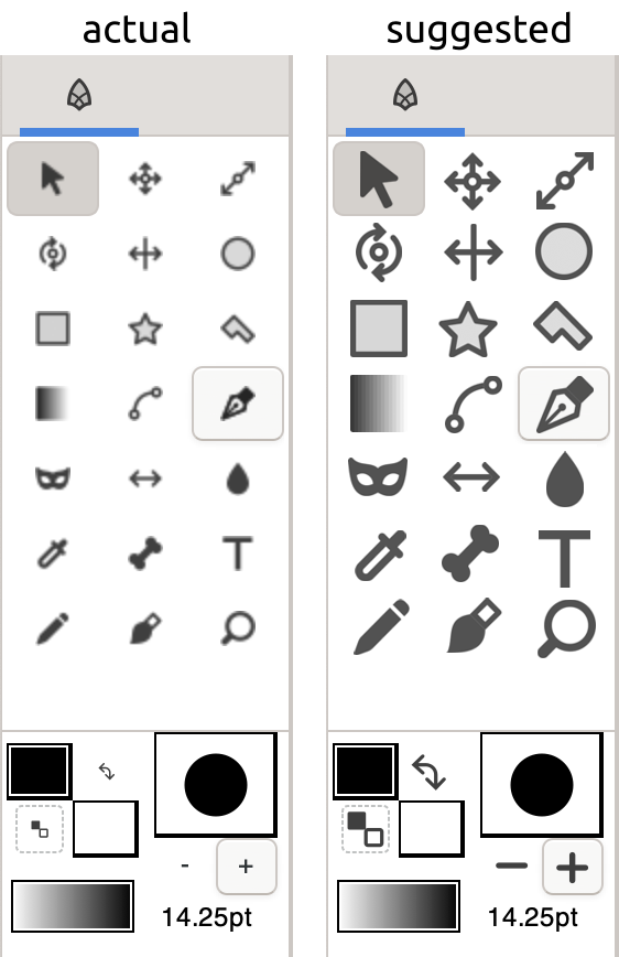
  • main UI is fully replaced (with exceptions of “adwaita” ones, more down), icons not designed are the Menu and Add layer ones
  • it’s important to have in mind that it will be needed to add more icons in order to have a real full icon replacement feature (more about this down)

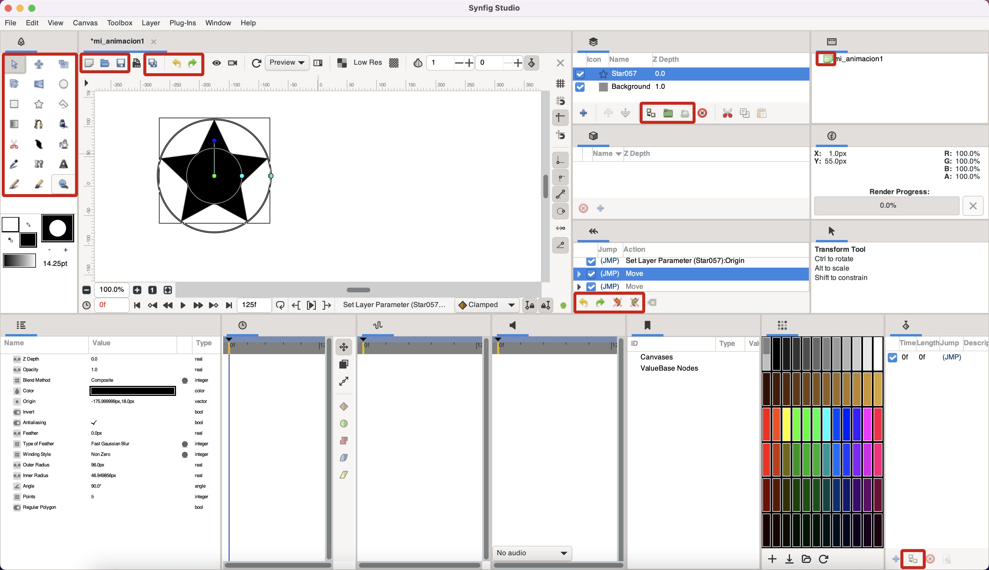
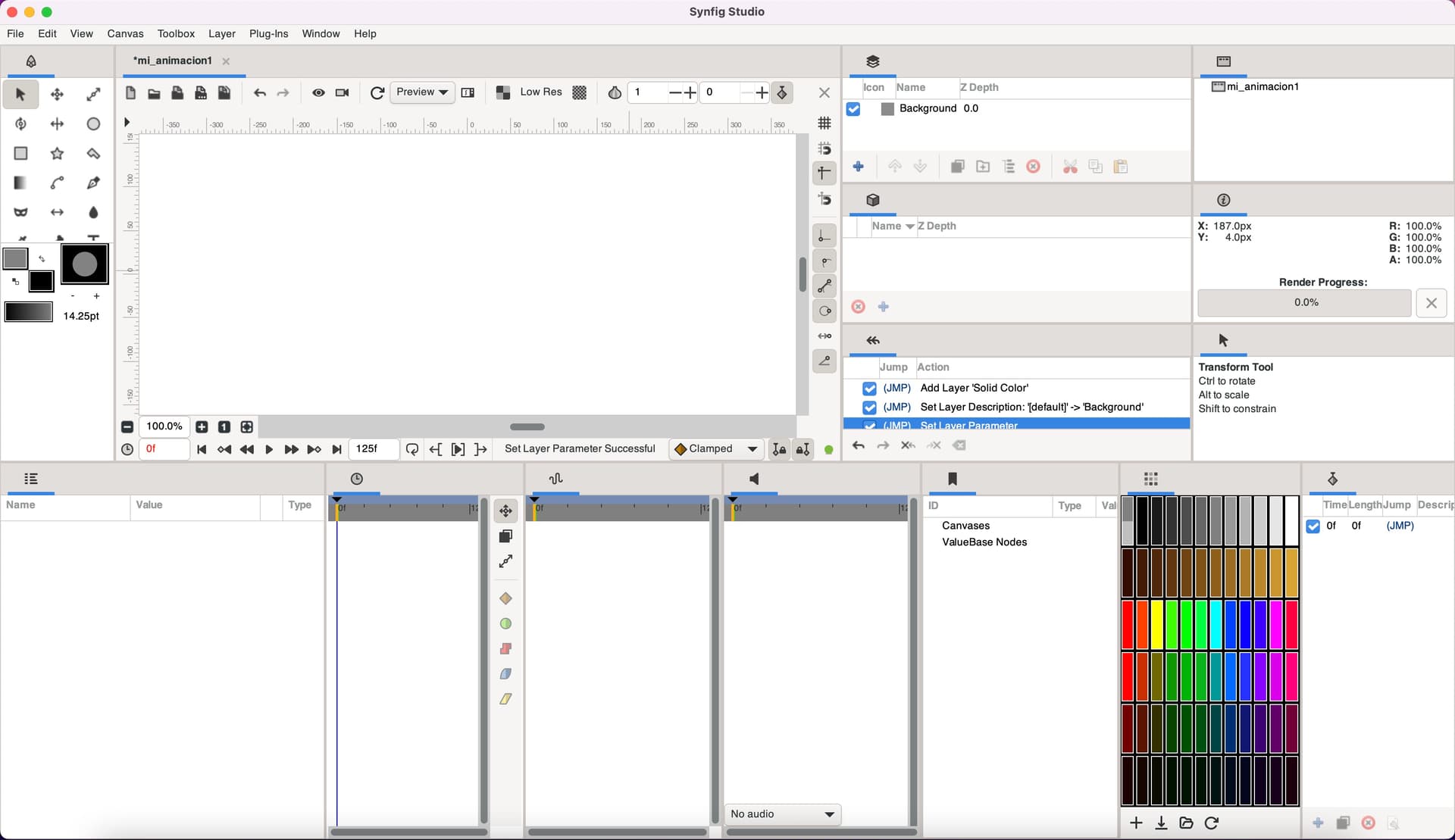
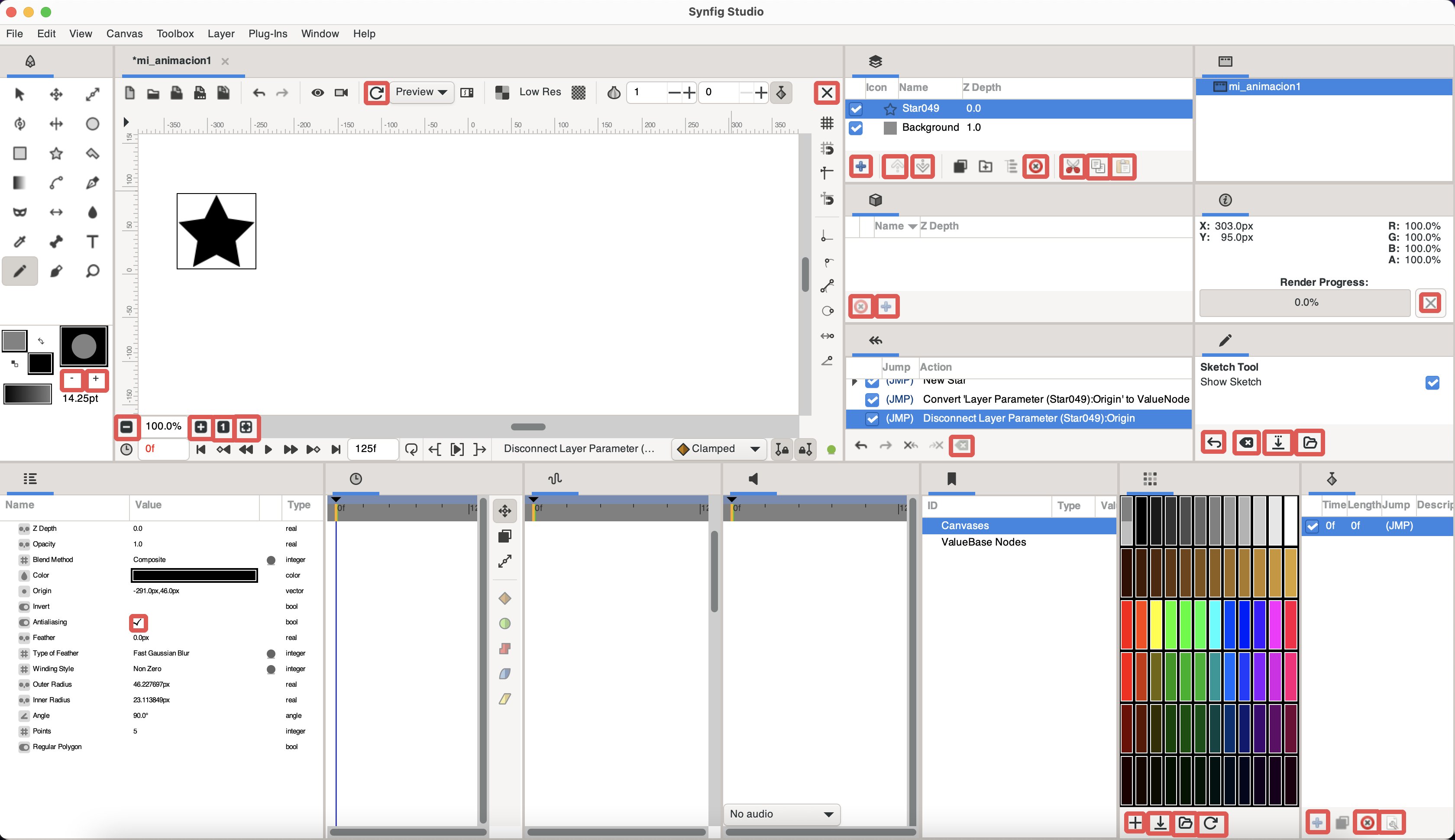
A screenshot with all panels open:

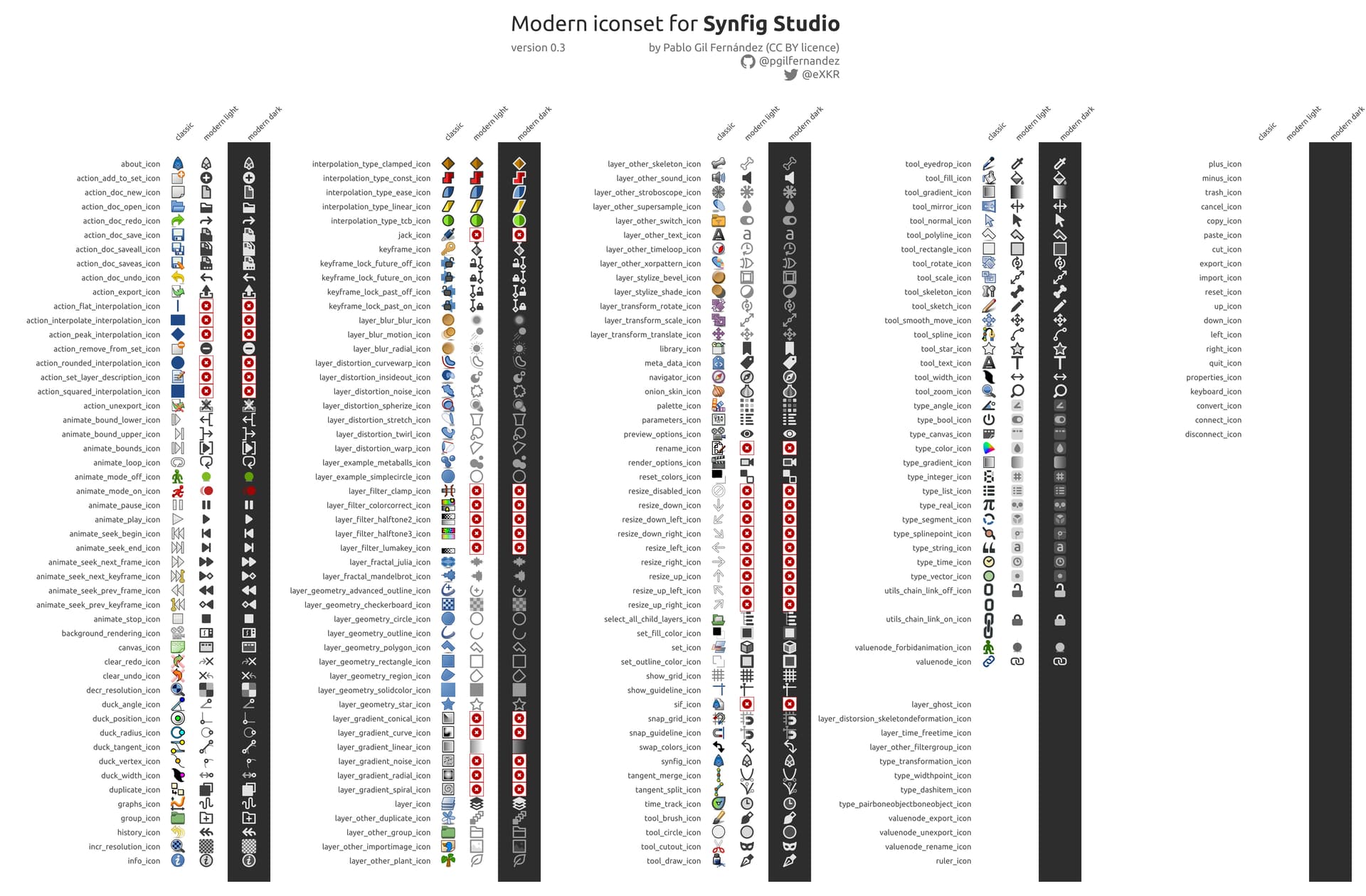
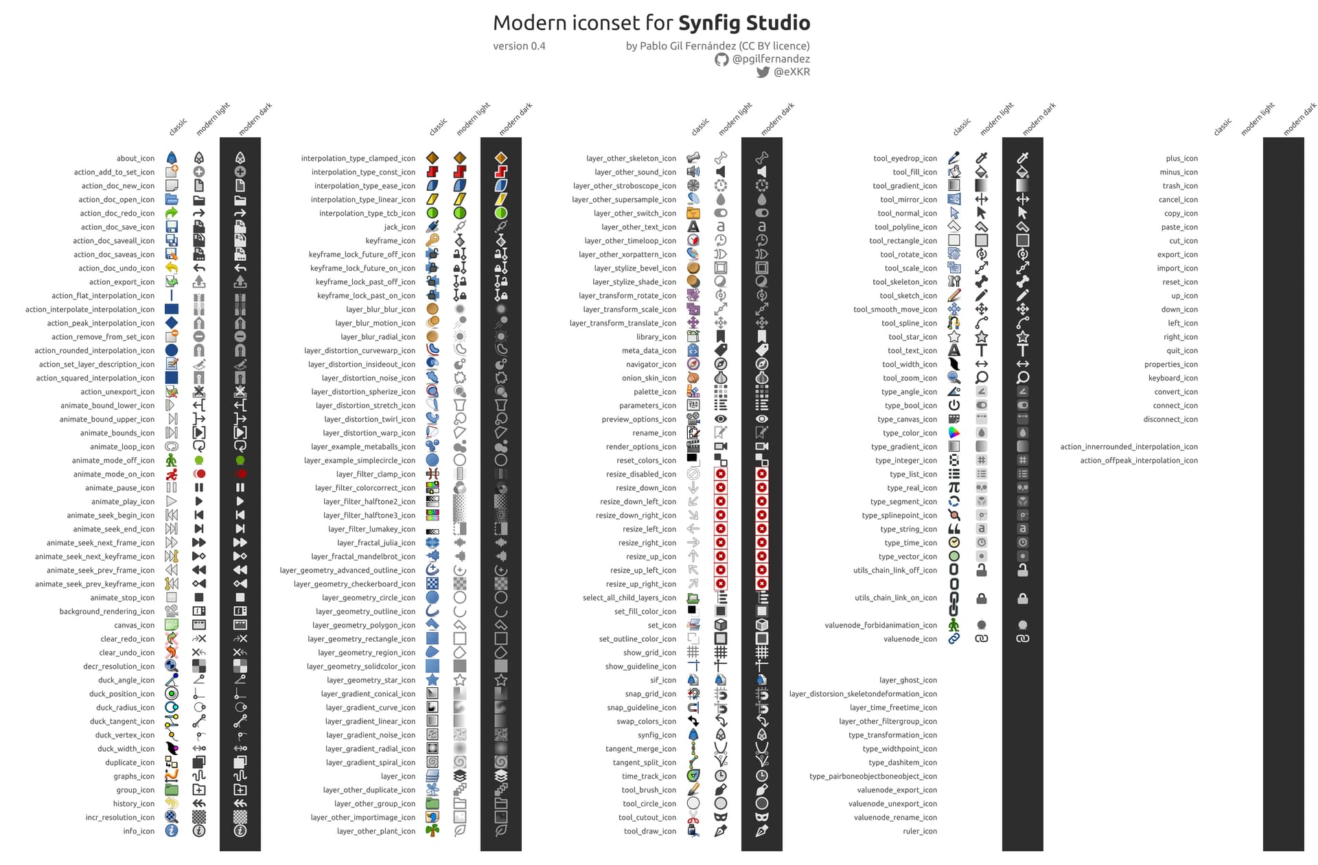
For development planning, I have also done a canvas with all icons inside the “classic” folder and with the new icons designed, both in their “light” and “dark” versions:

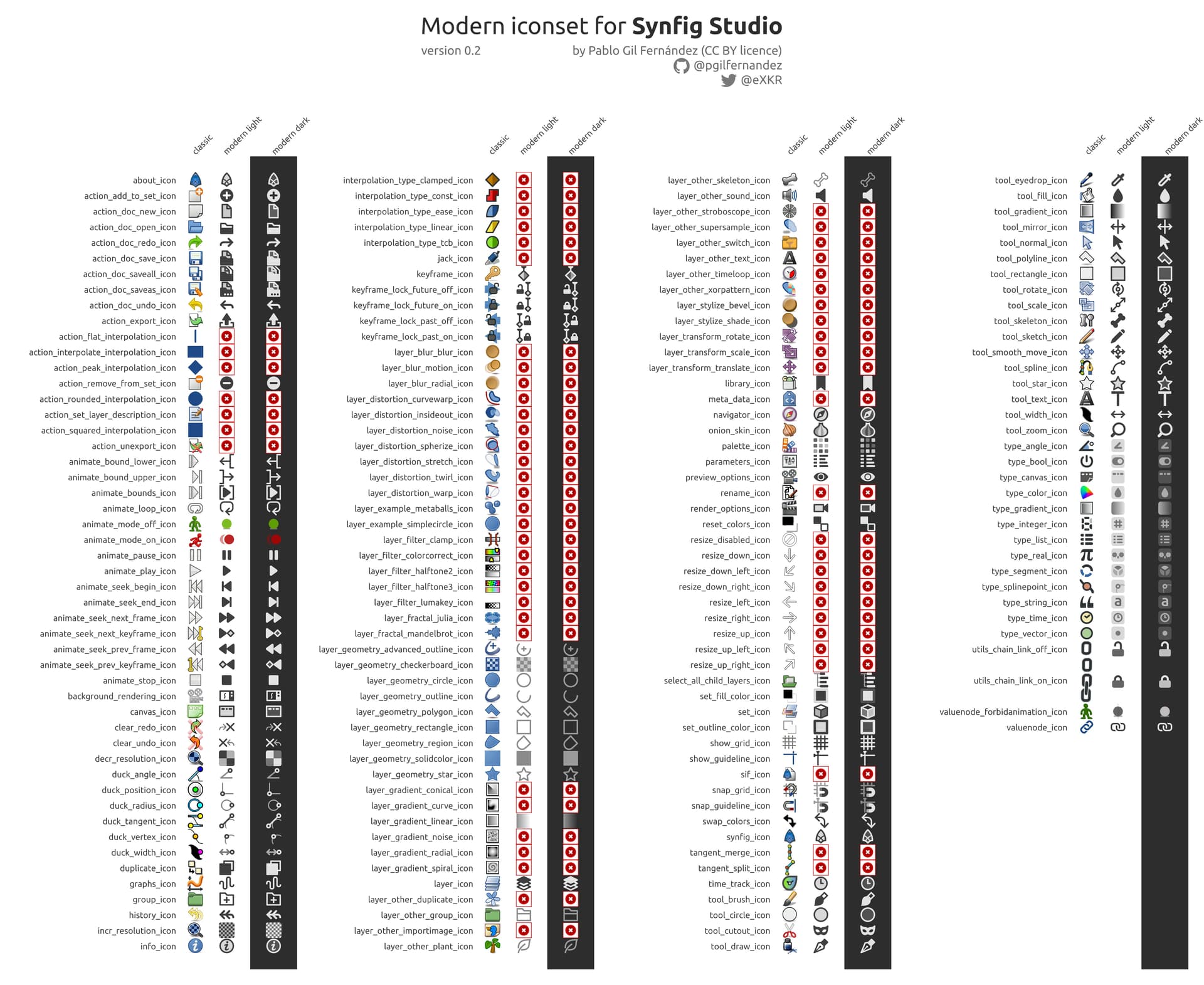
The icons that have a red circle with an X on it means that I haven’t designed the icon and should be done (I’m on it, hehehe).

Intrepid users may want to try them out so here you have a compressed folder with both “light” and “dark” versions, in order to install them you need to know:

  • they are designed with the newest Synfig version on mind, so you should use 1.5.1 version
  • I don’t know much about the progression of iconset replacement inside Synfig Preferences but, I can say, it doesn’t work properly by now (more about this down), so I suggest to install this icons the following way:

                  1. browse the following path in your computer [path_to_synfig]/share/synfig/icons/
                  2. rename /classic/ folder as /classic_original/
                  3. uncompress the zip modern_iconset_v02.zip (1,7 MB) and place it in /icons/ folder
                  4. you will find /modern_light/ and /modern_dark/ folder. Rename the one you want to use as /classic/
                  5. Launch Synfig and enjoy

About me

My intentions are to finish this iconset, not only all the ones in /classic/ folder but all needed ones in order to have a full replacement, so I will be committed to this task in the following weeks, months… I mean, this development is as serious and professional as I can (and my spare time lets me).

For those you want to identify me or know more about me:

  • I developed FreeCAD Dark and Light stylesheets (themes), already merged
  • I’m designing a FreeCAD iconset replacement… still in progress as FreeCAD has tons of icons and they grow each month…
  • I designed (and still designing) Olive Video Editor icons, already merged
  • I developed Sigil Dark and Light theme, but it looks as the main developers are not interested on themes and they didn’t pay much attention to my PR
  • and more stuff for Gimp, Inkscape, Excalidraw and more that is probably outdated and out of Synfig interest… you can check them in my GitHub site

Development notes, questions and requests

Now I would like to open discussion and ask for answers to a few flaws I found while designing and trying the new iconset:

  • as a designer, I’m taking some liberties to design the icons, so you will find that I have changed some of the completely (for instance the Keyframe panel, Cutout tool…). The idea is creating icons that are easy to identify with what they do. I hope you are open to this “big changes”. Anyway, I’m open to discuss them as well
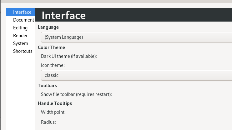
  • as said, the “icon theme” can be switched under Preferences/Interface but it doesn’t switch all the icons but a few. That’s the reason I suggested to override the /classic/ folder with this new iconset instead of trying this feature… So, is it in development or is it a bug that should be reported in GitHub?
  • there are some buttons that use “Adwaita” icons so they are not themable… I would suggest to create a copy of them with a id name so that I can design them (a few of them are already designed but I can’t add them into the iconset as they don’t have this id name that make them themeable). My findings point to these ones in the main UI:

    And under menus these ones:
  • following what I said in the two previously bullets, I’m willing to work on these code changes if any developer helps me learning how to do it as I’m not an experienced coder (I have some knowledge and I can code by myself but I’m more a icon and UI designer… I have experience with GIT, HTML, CSS, QSS, GTK not much…)
  • To my taste, dark theme (at least under macOS) is too dark… it that themeable as well? I ask it because it would be nice to be able to fine tune icons with a specific UI theme. Could any developer point me out to the place where I could edit the “dark theme” background color so that I can “play” with it?

Well, I’m probably forgetting something, but the post is long enough, hehehe.

Cheers and hope you like it :smile:

7 Likes

Another thing I forgot to comment:

  • Toolbar buttons have way too high padding (or images have too high margin) that make icons show so small even if those tool buttons are bigger that normal UI ones:

This happens in macOS and Windows, I haven’t tested Linux but it seems it’s gonna be the same.

4 Likes

When starting to study the icons from the “add layer” menus, I found out 3 layer that have no own icon:

I guess a developer may provide an ID name for that specific command so that I could include them as “themeable icons”. In the meanwhile I will design them.

I’ll take a look into it. For now, follow the current file name pattern:

  • layer_distortion_skeletondeformation_icon
  • layer_time_freetime_icon
  • layer_other_filtergroup_icon

There is another ‘layer’ that lacks an icon: layer_ghost_group_icon , that represents a layer that should exist in a Switch layer, but it doesn’t exist yet.

The Parameters Panel still misses some icons too, for certain parameter value types:

  • transformation (seen in Group layers and alike)
  • width_point (item of Width Point list, in Advanced Outline layers)
  • dash_item (item of Dash Item list, in Advanced Outline layers)
  • pair_bone_object_bone_object (item of Bone list in Skeleton Deformation layer)

And what a fantastic work! After some PR related to GUI are merged into the main code, I can work on the ‘port’ the code to ‘officially’ (and finally do) support Gtk 3.18, and this icon theme can be added to Synfig.

You don’t need to rename the folders. You can set the icon theme in Preferences dialog.

Great!
I’ll use that pattern. :smiley:

I read about that Ghost layer in the forums but as I still did’t know what it really does I haven’t pay attention to it but, I can always include it in “my list” and there’s room for changes in the near future.

I also saw that “transformation” parameter didn’t have an icon but didn’t know about the other ones. Added to my list :wink:

It will be a pleasure to collaborate in order to add it to Synfig master.

Yes, I know about this feature that will let users easily switch to one icon theme to another but, at least under macOS, it only switches some icons, not all of them. That’s why I proposed a workaround. Is the feature fully implemented? if it doesn’t work for me may I open a issue in GitHub?

I had a little time to analize what happens under macOS and which icons switch and which don’t, here they are:

Is that a bug then?

I have just tested it on Windows and it behaves the same, same icons doesn’t switch.

Some icons are not directly from the Synfig Studio, we get them from the GTK (the graphics toolkit we use) theme. This is for some common actions like undo/redo/clear/new/open…

I suppose this choice was based on making the UI consistent with other GUI apps (icon themes are/were common on Linux).

Yes, it makes sense.

Now that there is an option to change icon themes that behavior may change if you really want a full icon replacement as those “system icons” won’t fit with any theme but the “classic” one…

Another option could be to make Synfig look inside your icon theme folder and if it doesn’t find, for instance “save_as_icon.png”, then apply the “system icon” but if it does apply the one from that folder that matches the icon theme.

New version, v0.3:

  • 158 icons “modernized” of 213 estimated (around 190 “as today” themeables and 33 additional ones that need further code changes but make the whole set of Synfig icons themeable)

Download v.03 here: modern_iconset_v03.zip (1,3 MB)

As commented in my first post, although under Synfig v1.5.1 Preferences there is an option to change “icon theme”, it only changes some of them, not the whole set so I suggest to test the modern icons as follows:

  1. browse the following path in your computer [path_to_synfig]/share/synfig/icons/
  2. rename /classic/ folder as /classic_original/
  3. uncompress the zip and place it in /icons/ folder
  4. you will find /modern_light/ and /modern_dark/ folder. Rename the one you want to use as /classic/
  5. Launch Synfig and enjoy

I’ve found more icons that are no themeables and some that may need to be splitted as they are used for different things (panels and layers) and it would be nice to have different icons for each. Also some other things that I think it’s better I move them as issues at GitHub.

1 Like

@pablogil Are you drawing them as SVG or directly as PNG?

They are indeed been designed as SVG :smiling_face: and using the amazing Inkscape.

By now I’m not sharing them as they are a work in progress and because Synfig is unable to load them natively, right?

Anyway, if you are interested I can always create a GitHub project so that you follow the progress and in case you would like to tinker with them…

Once I update our Gtk support, we can use symbolic icons :slight_smile:
https://wiki.gnome.org/HowDoI/CreateSymbolicIconsThatChangeColorAccordingToTheme

That will be great!

I have checked the link and I’m already following those rules so I think there is nothing to change when you update it but to create the folders :smiley:

New version:

  • 178 icons “modernized” of 213 estimated but
  • at this point all themeable Synfig icons are finished so you could try this version and enjoy the new theme as the very best that now the app can offer
  • there are 9 that looks like they aren’t in use so I haven’t designed any replacement yet
  • there are around 33+ additional ones that need further code changes but make the whole set of Synfig icons themeable (that will be my new task: design the icons for Classic theme, then the Modern theme and finally make code changes to make them work)

Download v.04 here modern_iconset_v04.zip (1,5 MB)

As commented in my first post, although under Synfig v1.5.1 Preferences there is an option to change “icon theme”, it only changes some of them, not the whole set so I suggest to test the modern icons as follows:

  1. browse the following path in your computer [path_to_synfig]/share/synfig/icons/
  2. rename /classic/ folder as /classic_original/
  3. uncompress the zip and place it in /icons/ folder
  4. you will find /modern_light/ and /modern_dark/ folder. Rename the one you want to use as /classic/
  5. Launch Synfig and enjoy

I hope you like the update :smiley:

4 Likes

@rodolforg, how could I check the Ghost Group layer funcionality so that I can design an icon for it? I have seen references in the source code but it looks like it is not operative… am I right?

Thanks

Ghost layers are layers that are supposed to exist in a Switch Layer, but don’t.
The Active Layer Name parameter of a Switch Layer can be set/animated with non existent inner layers. In this case, Synfig Studio will show fake/bogus layer children with those names.

A user-written sif file can have it, but here is a way to make it, and the correspondent file:
ghost-layer.sifz (1,2,KB)

  1. In Synfig Studio, create a new file
  2. Draw a circle and rename it as Circle093
  3. Draw other two circles and name them as Circle02 and Circle03
  4. Select all layers (ctrl+shift+a)
  5. On Layers Panel, right-click on any of them and select Group Layers into Switch
  6. Enable Animate Mode
  7. Select the Switch layer on the Layers Panel
  8. On Parameters Panel, choose the Circle093 in the Active Layer Name parameter
  9. On Layers Panel, rename the layer Circle093 as Circle01
    ^- Now there is the problem. To make it visible, close and reopen this or:
  10. Skip to other time (10f, for example)
  11. Choose the Circle02 in the Active Layer Name parameter
  12. Look at the layer children of the Switch layer.

Other way to make it happen is to import a lipsync file that you didn’t prepare all the mouth shapes.

1 Like

Thanks @rodolforg, now I know how to get a ghost layer but… is this a bug? I mean, in what scenario would it this be useful?

I would say that if you rename a layer which is inside a Switch Layer, then the Active Layer Name should update with the new name, doesn’t it?

Finally, I guess this is the ghost layer that I should design the icon for, right?
ghost

Thanks again