I’d like to suggest a change in z-position layer parameter.
I see that the z-position of a group is the high level. Inside the group, the layers are ordered with its own z-position level, but that level doesn’t escape out the group.
That could be right… but it’s not natural when you have a jerarquical character with interaction between layers of different groups.
For example… let’s check out to this examples:
Example 1:
         + background
                  + first_plane
                            - flower
                            - table
                  + middle_plane
                            - bed
                            - character
                  + background
                            - wall
                            - door
 In that setting is cool that the groups (+) have max preference in z-position. Every group belong to a z-position range.


Example 2:
        + character
               + head
                      + eyes
                            - eye_L
                            - eye_R
                      + nose
                            - nose...
                      + lips
                            - lips...
               + body
                      + body
                            - body...
                      + arms
                            - arm_L
                            - arm_R

          + ...
      This is my way of set groups. I think it's efficient and logic.

      Here there is a annoying problem. Goups don't belong to a single z-position. Eye_L and Eye_R could interact with nose but Arm_L can't do the same with head, because the z-position of body has high preference. If you change it... all the inside layers rise up or down together.


     So, I think that could be more interesting that z-position were a independent parameter of groups... so only for layers.


  Edit... :slight_smile:

 In this way... Could be possible that vertex in spline had z-position repect other vertex of the same spline? I really don't know if it is possible or not at all... but could be a really interesting drawing-animating option.
That would be certainly need! We don’t even need a full camera, because you can achieve that by just having a “Translate” layer at the very top. But to be able to use it to its fullest extent, we COULD have visibility beyond the camera too.
Agree with that. It would facilitate camerawork with “fake camera” layers like translate and zoom, plus you would have the ability to use the space as some sort of visual library shelf.
I put here some others ideas that bring to me the use of Synfig. This time is related with waypoints and timer section. I’ll copy the text that I put incorrectly in other message.
I think that is really interesting copy&paste more than one waypoint. It is really annoying select one waypoint-goes to the correct time-paste waypoint-goes to the next waypoint-copy-goes again to the next correct time…etc.
So, if you could copy more than one waypoint and paste with the same times between them animation would be faster.
Other thing: possibility of change the color of the waypoints. When you are animating an object of a group, it is interesting see the waypoints from the group… but all the waypoints of all objects in that group are the same form! It’s very annoying must to select the object or “imagine” what waypoint is of a object from the time.
If you could change the color of the waypoints could be easy to asignate a color to an object and would be easy to see from the group view. A popup with information of what object modify that waypoint could be interesting, too… but the color would be more fast to see.
For last. I think that must be thinking in separate (or living together) the waypoints from the timer-view. Of course, that is fine, but I think that an object must have his own waypoints. This could be used to enter in the neccesary library of objects.
It’s a bit annoying that you can’t reuse animated objects between files. If an object have his own waypoint the export-import would be simple.
The waypoints of an object must be grouped. So, you could make: walking, staying, closingeyes, animation1… etc. That tags would have its own set of waypoint that you could drag and drop in the timer view at the time that you’ll want.
I think that differentiate the waypoints are really necessary.
Synfig has some incredibly impressive effects and distortions in its repertoire. Would it be far-fetched to use some of the existing distortions to create new kinds of “simpler” effects, like say…
…3D Cubes? Please, work with me here.
What I mean is that being able to create a 2D-looking 3D space or object. We can start off by experimenting with a 3D cube. Basically, the Cube is simply an “object” much like a Star or Circle, but with parameters to adjust its hieght, width or length, or even the entire size. And it can rotate much like a star, except in “almost” every direction (the directions it doesn’t do can easily be fixed with Transform layers).
I got this idea when I was wondering if it’s possible to use some of Synfig animations as “textures” of a side of a rotating cube – not in Blender, but Synfig itself. We have perspective morphing and Z-Depth, and it can be utilized to create such a “folder-filter”. In fact, this could be used to make simple BUILDINGS too!
And no, you don’t need to model the cube like you do in Blender. This cube is just an illusion that works really well (unless you really WANT actual 3D algorithms in Synfig, then that’s fine with me too). Think Mode-7, a clever technique used in consoles that could never support 3D (such as SNES).
Bezier splines (which Synfig uses) are affine invariant. This means that applying a transformation to the spline can be achieved by transforming just the control points, which makes it a dirt cheap operation. Guess why transforms are so pervasive and fast on SVG (ie. inkscape)? One problem: perspective transform is not an affine transform (it is projective).
To synfig it doesn’t matter, because it always transforms the pixels rather than the shapes. The downside of that method is the huge performance hit (as can be seen on Synfig).
Rational B-splines are projective invariant, which would make it cheap to apply even perspective transformations.
But why stop there? It is also possible to apply curved transformations to spline objects, and do so somewhat cheaply. So one could not only map vector graphics to a 3D cube but also to a 3D sphere or any freeform 3D spline surface for that matter.
That was the idea behind my Free-form deformation effect. There are still some problems with that technique though (ie. higher order bezier splines). I’m still investigating how to deal with that.
One thing that’s currently lacking: Multi-waypoint deleting thing. (So that we can remove all waypoints and be able to edit in non-animate mode again)
I know that “Disconnect” option works in most parameters, but doesn’t do well enough in Vertices paramaters. Try making a bline with region and outline, go ahead animate them, then Disconnect the vertices. Yeah, sometimes waypoints don’t disappear, but here, try moving the tangents and vertices in the canvas now.
…See what I mean?
Also, we might also need to figure out a way to edit in non-animating mode even though the animate-mode vectors have changed. Basically, I mean something like Blender where Object-Mode and Edit-mode stuff can… erm… probably never mind.
How about time selection like audio editors have. Simple mockup:
Note: I also extended the parameter selection into the timetrack window. This would also be a nice feature to have.
Then the waypoints in the selected time range and selected parameter(s) can be removed via right-click > Remove waypoints.
Time selection could also be used for other things, like copying a section of animation from one time position to another (or even from one parameter to another, assuming parameter types are compatible).
I love that idea! Though, since we’re at it, selecting keyframes like in audio-editors would also give us an open window to have Blender-like waypoints management, whether scaling or translating (by pressing S or G).
I think that, in general, all these Open Source Graphic Software should follow a certain standard. Or at least, follow a common language.
In the example above, A “blur” must be a “blur” on all this software, as an “stroke”, or a “path”.
On the other hand, I don’t have problems with difference of style between a path node in Synfig, and other path node in Inkscape, because it’s obvious what represents in each program. I put this as an example, based in previous topics read. No offense to anyone.
Other thing that bothers me is, when a parameter is linked to other (not exported), there is no feedback about what layers are involved.
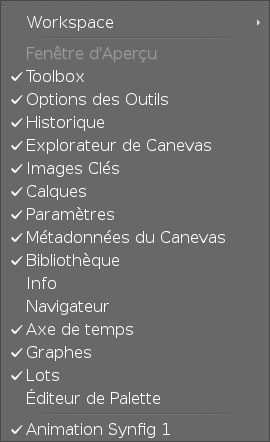
What do you think to have a visual information for opened panel in Menu / Window ? (same visual information that the one for Menu/View/Guide)
I was about to add that enhancement, but maybe i’ts not interesting …
Now i know… .it’s not a good idea. The toggle information in a menu inform the user that the action will be undone if already done : that not the case here.
So if we want to inform the user what are the opened panels, it’s another kind of visual information that must be displayed.
Any idea ? . (bold when open come to my mind, or italic if not open … )
The synfig interface is quite complex… hummm … less quite hard ever.
But, i think users (particularly new ones) will miss this action if entry is grayed out or removed (but how new users could mess an action they don’t know about ? ) has briing to top really help to find the eggs in the basket… (i was thinking to highlight the panel when already open !)
I mean, it takes like 10 seconds top to click thru all tabs to find an specific one. And if the panel is “hidden” behind other windows then the “bring to front” doesn’t bring the window to top (only the tab). So that would need fixing also.
On the other hand, greyed out entries sends a pretty clear message “you can’t open this panel, because it is already open”.
Anyway, use bold text if you want to mark open panels. It’s what the new Switch Group uses to highlight the current visible frame, so we have a bit of consistency going on.


 It is also possible to apply