Making a Pie Chart Animation

Hi,

First of, this is such a cool program! A steap learning curve, but still. Might be only me, but I’ve noticed more tutorials popping up on youtube now showing how to use Synfig, so it seems to me more and more like it, and will use it.

Now, I’ve been trying how to figure out how to animate a simple “Pie Chart” type of animation. I did some tests in blender, but since I am really only looking for 2D, Blender feels like overkill. Besides, it isn’t all that easy there either. And also, rendering it will take time.

I’m looking to do something like you can see here: youtube.com/watch?v=0FMCQKUF0Mg and figured Synfig must be quite the tool for it. However, I have not figured out how I can do this easly. The circle I create in Synfig doesn’t have a handle to segment up the circle (Like Inkscape has). Only a origin and a radius handle. So, I can’t animate that easily there from what I can tell. And I really do want a “perfect” cirle, and not try to fake one with a spline tool. Seems it can become messy using the spline tool anyway.

I feel Synfig must be able to do this somehow. It’s so advanced with connecting and grouping things, so this simple thing must be possible. I just want to segment up a cicle (pacman with a mouth with different sizes), and animate the sizes of these segments in the cirlcle.

Can someone help me out here? What am I missing?

Thanks!

You just need to create an imperfect pie chart animation with splines and then mask it with a circle layer.
I’ll show you one example if you don’t figure it out.
-G

Hello,

This challenge interest me.

Maybe there are other ways to do the pie charts that you want. But I’ve found that using a conical gradient converted to gradient rotate can easily and quickly simulate an effect like you want. However, it’s question that you try with the variables to obtain the result that you want, sometimes intuition, and sometimes consult with the Wiki-manual. I still don’t get it how the offset variable works with the gradient, but it works!

I’m attaching a sample that I did in the version 0.65 of synfig, but i saved as version 0.64.1

animated_pie.gif
animated_pie.sifz (1.86 KB)

This is the result of the explained above. The document renders badly on canvas window due to a masking bug fixed on development version. Final render is fine.

You can go further this and calculate the angles (or %) of each piece by using the convert types. I don’t have time to do that but I can do if you want but later.

The shapes are made all using splines and circles as mask, except the outer outline that is a circle with bigger radius.

Scheme is like this:

Group
-Pie chart using splines (Straight Onto)
-Inner circle
Group
-Outer Circle (Straight Onto)
-Clone of pie chart using splines (all vertices linked)

Outer and inner circles have origin liked to central vertex of the pies.

I hope it helped.
-G
pie-chart-0.64.1.sifz (2.93 KB)
pie-chart-0.64.1.png

I’m not able to open this up. I get a
animated_pie.size::479: error: Bad type in

error.

Also, I’m using 0.64.2 of Synfig.

Wow, thanks for the reply, but this setup really is quite complex. Just open that file up and trying to understand how it works is perplexing. How would I go on and animate the wedges there exactly? (Just like the video I mentioned in the post).

Just click on a pie and you’ll see the vertexes of the triangle it is formed by. Click on the outer vertex and move it. The edge triangle side would follow it because they are linked.
-G

Hello,
I’m using the version 0.65 revision 20140617, according the about screen.
I’m supposedly, saving to the version 0.64, using the Save As dialog.

Maybe it’s something still not implemented??

Attaching again
animated_pie2.sifz (1.79 KB)

No, it won’t work. There is not code behind that.
-G

This somewhat works, but moving those for the yellow one, changes the pink one too. Check attatched file. Might be because me running 0.64?
pie-chart-0.64.1.0120.png

Thanks, but still get that error. Is there a 0.65 ppa repo somewhere?

No, not is that. Maybe it is just I made a mistake with my setup.

I don’t think so but upgrade to 0.64.1 to verify that. If I made a mistake then I’ll fix it as soon as I have free time.
-G

Sorry, I’m mean I’m running 0.64.2.

One third try
animation_piechart064.sifz (1.12 KB)

Wow, cool. That is pretty nifty! Yea, works opening now!

Hmm, a gradient for the circle thing. Clever. Who knew you could do these kind of things with Synfig! :slight_smile:

Make a circle sector and animate it :slight_smile:

If I knew how to do that, I wouln’t have posted here. :slight_smile:

As you noticed Synfig can’t do circle sectors directly. Instead some blend method trickery is needed to simulate it. It basically consists of cutting out a circular shape out of a polygon shape.

The cutting part can be achieved by something similar to this:
wiki.synfig.org/wiki/Subtracting_Shapes
The only difference is that the circle is inverted to make a circular cutout, rather than a circular hole.

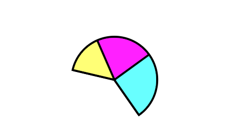
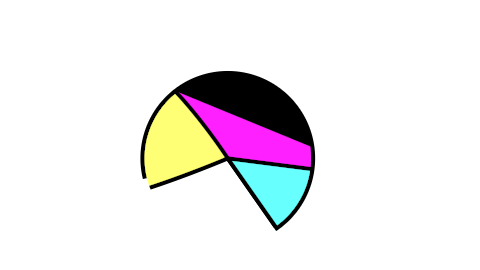
Once you have the circle with Alpha over you can place a Polygon under it. If you play a bit with the polygon’s handles you can manually make a pie chart sector. But you need to be careful with the handles to avoid some stray polygon edge from cutting into the pie chart, breaking the illusion (as it happened above with the pink sector).

In the file I posted in that other thread the polygon handles are calculated automatically instead. The two important values are ang1 and ang2 in the Library tab:
snapshot18.png

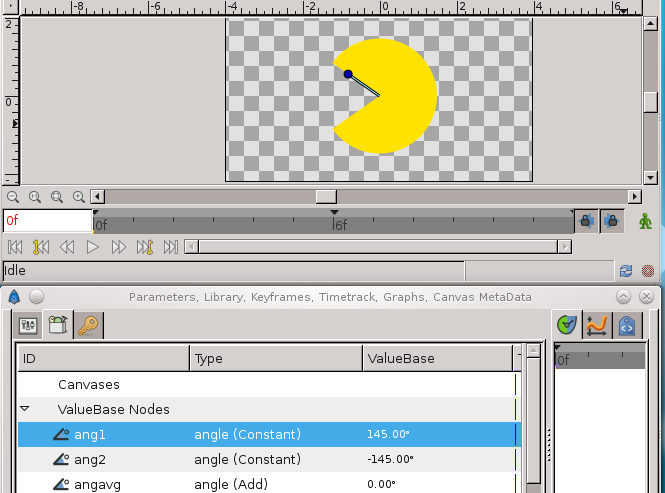
These two angles define the circle sector which is filled in (in a way similar to how Inkscape works). The polygon vertexes are calculated automatically (using Synfig’s valuenodes) starting from these two angles. I removed the animation from the file so you can play with the ang1 and ang2 values yourself:
pacman-3.sif (29.2 KB)

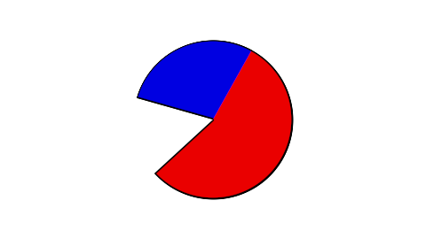
In summary, the midpoint between the two angles is first calculated and then the midpoint between that and each one of the original angles. These results in 5 angle values, which are used for 5 of the vertexes for the polygon shape (with the last vertex being at the circle’s center). This calculation ensures that the polygon only cuts the circle at the desired part to achieve the pie chart shape.

So what does all this means for you? Well you can copy&paste the entire PieSlice group into a new file and work from there. Buuuuut you need to first Unexport the ang1 and ang2 value from Library tab (right-click > Unexport), otherwise the new copy of the group will reference back to the original PieSlice (in the other file even!).

Once copied to the new file you’ll want to open the PieChart group, select the Polygon004 shape, go into the Parameters, into the Vertices List parameter, into Item 1 and export the Theta parameter (right-click > Export) inside of it, and also into Item 5 and export that other Theta parameter. Those two values you exported are the ang1 and ang2 values we had previously, but for the new copy of the pie slice. The process of Unexport > Copy&Pase > Export ensures each pie slice is independent from one another.

You can repeat that process as many times as you want to get as many pie slices as needed. Just make sure to follow the Unexport > Copy&Paste > Export procedure. The fill color of the slice is simply the color of Polygon004 (the color of the circle doesn’t matter, only it’s alpha value which should be 100%). The outline of the pie shape is the combination of the two outline layers (one for the curved part and one for the straight parts).

Wow, huge thanks for this last one! This really shows how powerful this Synfig is! And, it is so much easier to work with the exported angles like this. Just how I like it. So much handier to just have the two angles exported like that, and animate those. Only problem now is that if I want to start with a full one, that “Polygon004 Outline” draws this outline when I dont want it. Otherwise the outline is nice.

You mean something like this:
piechart-1.png

Here’s what I did:

  • Copy the PieSlice group from pacman-3.sif
  • Paste it twice, rename the one above PieSlice1 and the one bellow PieSlice2
  • Delete the outlines inside PieSlice1
  • Drag the outlines inside PieSlice2 outside both groups and place them on the very top
  • Select the Polygon004 inside PieSlice2 and export the angles as before (named ang1 and ang3)
  • Select the Polygon004 inside PieSlice1 and export one of the two angles as before (named ang2)
  • Connect the other angle to either ang1 or ang3. Do this by first selecting either ang1 or ang3 in Library tab then right-click > Connect on the Theta parameter

Now you have two pie slices with one outline around them. The ang2 value needs to be kept in between ang1 and ang3 otherwise things break.
piechart-1.sif (30.6 KB)