Thanks, but I really ment this:
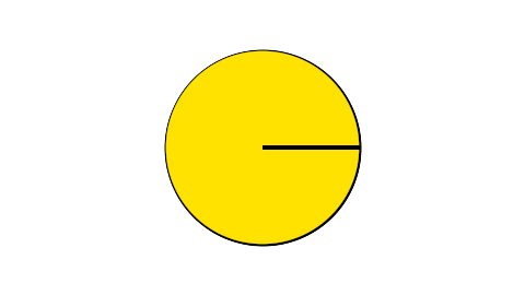
This is supposed to be 100% filled, but the outline will do that black line there.
Thanks, but I really ment this:
This is supposed to be 100% filled, but the outline will do that black line there.
I can also add that I do prefer each edge have their own outline.
Best scenario would be to have kinda like this last one, but each wedge has their own outline, and that I can manipulate each wedge in different ways. Such as offset it and scale it. I guess that will be a bit too much, but at least have outline per wedge would be nice.
Hmm, that would be a bit tougher to deal with. Specifically as the slice approaches 100% full, how should the outline behave?
One way would be for the yellow wedge to progressively “bite” into the black line until it disappears, but achieving that effect would be a bit tricky since we are faking the wedge outlines on Synfig. I have some ideas on how try to achieve that but it would take a diferent more complex approach.
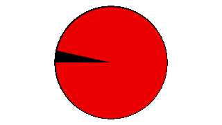
This one is like 50% of the way there:
piechart-2.sif (9.61 KB)
The tough part is removing the extra black leaving only the thin outline.
That is cool, but is there a way to animate the outline showing up as sson as you don’t have a full circle?
Improved version:
piechart-3.sif (18.1 KB)

This gives an idea of how it works:

The piece of black that needs to be removed is in the intersection of two polygon layers. In the RemoveBlack group there’s a solid color layer which fills everything, then two polygon layers which erase their shapes. Then the result of the RemoveBlack group (ie. blue shape above) is used to erase part of the black slice.
Works perfectly only for slices only more than 50% full. Small/thin slices look wrong. Need to figure out how to get around that problem.
That is really cool! What’s left besides what you said would be to have additonal wedges created as well.
Hello,
This might also be another way to do it. It’s not perfect and needs some fine tuning, but still… 
Best !
 CAMEMBERT.sifz (1,7 Ko)