Just started… don’t expect too much and I would appreciate feedback and discussion on this.
I will implement a light version for use on dark themes after the all icons be completed based the parameter link feature of Synfig Studio. And hope it would be flexible so that you as advanced users can easily tweak to get your own set with suitable for your desktop environment theme with a few additional actions.
You are right, I will take it into account when polishing those icons, thanks.
Hi, All, I have update the image in the first post, if you would to compare the previous versions, please go to the github repo and use its versioning functionality
I am highly support the holes in the image layer icon. That will fit very well into our concept of frame-by-frame animation, where individual frames are represented by image layers.
Add a palette (including color chart and time:
– It would be easy to tweak the whole icon set for using on dark DE theme env.
– The time(silder) is used for rendering of multiply icons in one sif file)
Makefile.am file for render in CLI
[attachment=0]Screen Shot 2013-12-29 at 2.56.37 PM.png[/attachment]
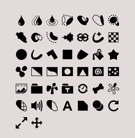
Still at the prototype stage, as you can see, for some icons, Gradient Tool in this case, it is quite hard to figure out a suite-able metaphor:
[attachment=0]icon_font_toolbox.png[/attachment]
Looks great but why would you need a methaphor for gradients? Why not use them as you have here but a little bit more detailed, perhaps a gradiented box/sheet of paper/kidney shape/etc.?
Ok, I intended to make this icon set as a iconic font too, hence gradient should be avoided in design. After played with Gravit (it uses Font Awesome Icon Set for their UI) a bit, I feel iconic font would be really nice and even better than I imagined before.
Thanks Konstantin’s idea, we found the neat idea for Gradient Tool (which can be easily extended to introduce value type, gradient layers icon as well).
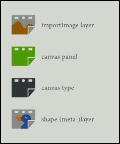
Now, layer icons are going to be completed, only Filter Layers remained.


 more will come in coming years (or months