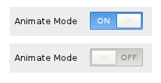
The new Animate Mode Off/On icons:
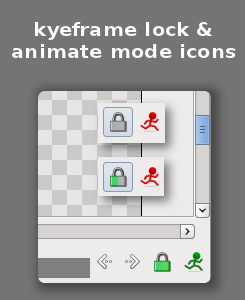
The current keyframes lock is not clear enough for its meaning in the actual size, this trial is intended to address it. I am not sure if it is better than current one.
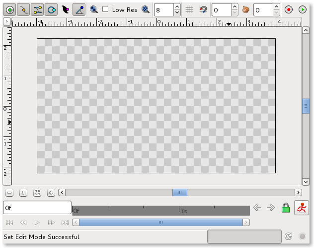
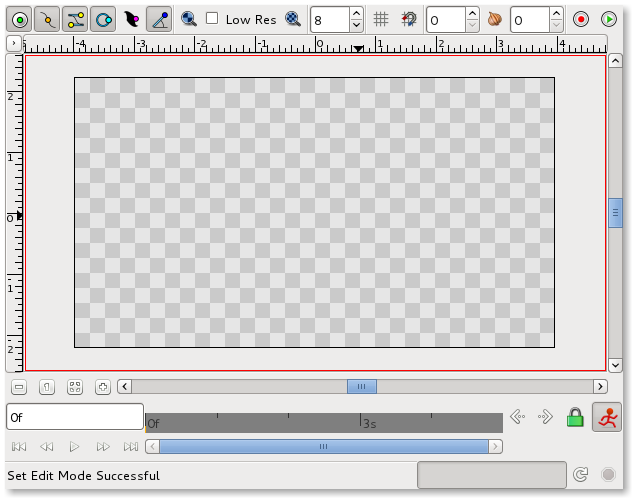
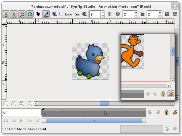
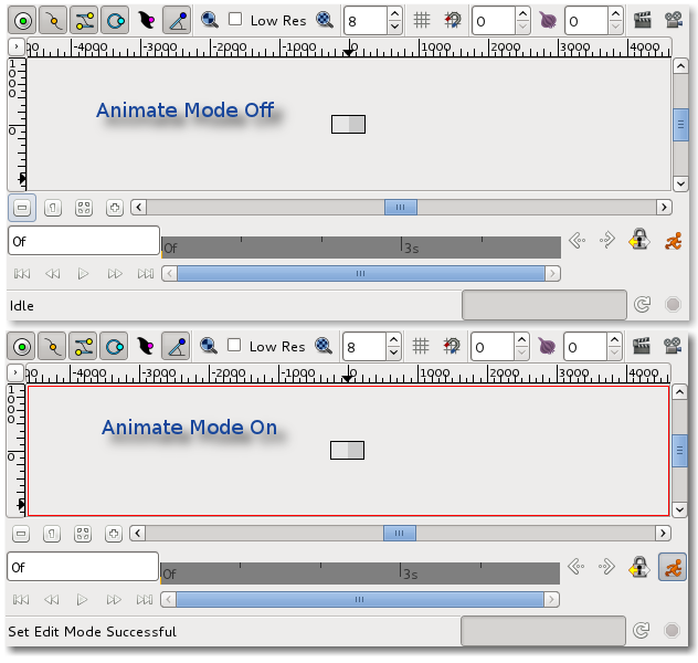
What does it look like in real:
The new Animate Mode Off/On icons:
The current keyframes lock is not clear enough for its meaning in the actual size, this trial is intended to address it. I am not sure if it is better than current one.
What does it look like in real:
I’m thinking that Animate off mode should not show a person running. I can’t think how you should show someone not changing in a single frame, but I think that’s what we should aim for. There should be some other symbolism that conveys the difference between being in the mode and not in the mode rather than just the colour.
Now that you want to rework both buttons I have some suggestion you should follow:


Also, we can think on add a blinking light somewhere that will be off in non animation mode and red and blinking in animation mode. I think that this last one will be disliked by Zelgadis … 
That’s my contribution for the general confusion and enjoyment.
-G
Thanks for your inputs. All of them should be taken into account  I will post updated version of these two icons.
Btw, I setup a repository for this icons task so you can get the src(sif), rendered(png) and my TODO.
Icons Design: github.com/jcome/synfig_ui/tree/master/icons
Icons TODO: github.com/jcome/synfig_ui/blob … icons/TODO
I intend to polish the current icons, we can not just throw out all NICE ideas about UI/icons and saying we should change the whole thing to implemented them. I think this polishing job is more doable at the moment and can effectes Synfig Studio quickly.
The UI / UX redesign sould be based on the synfig way or synfig workflow. I have to learn and understand it more.
More will come later as I always say
Thanks for ur help.
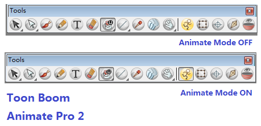
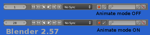
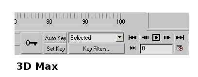
[size=150]Animate Mode Button : Relevant Art[/size]
TB AnimatePro
Blender 2.57
3DMax
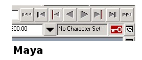
Maya
My answer is TOGGLE BUTTON. to emphasize this special button I use the style in toolbox instead of those button on the top of canvas window.
What is your opinions
[edited for typo]
personally speaking I prefer text “Animate Mode” and the new [on/off] button introduced in Gtk3.
Yes, looks clearer.
I like the idea of a toggle button too.
What’s that on/off button from Gtk3?
-G
Ok, then I will go to the toggle button idea
and fine-tune the icon of animate mode.
I do prefer a simpler walking man. Less details even. And what about a toggle button with changing icon? a red static stickman in non animation mode and a green walking stickman in animation mode (like a traffic lights). If the user is color blind there is a icon shape difference for each status, apart of the toggle button.
-G
Actually, I tried to use your Avatar as the icon yesterday , but it was not easy to tweak it suitable for a button in 16x16 size
Is it a bit complex for a toggle button? I mean the toggle is simple and clear as those on the top of canvas window. so let me finalise this patch and letter on, I will get it a try following your advice since this kind of task will help my coding knowledge improving as well 
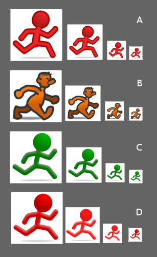
A C D is almost same, but A is more tango-ish.
C and D is the same character in different colors.
B intends to have a more cartoon-ish icon.
Which one do you prefer? stickman( A C D) or cartoon-ish walk man.
Can you draw the B type looking front and stand by? I would like to have all the versions at sight.
B type starts to looks good to me 
-G
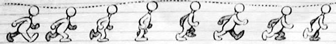
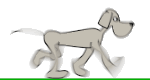
Hi I just make a tango-ish walk man (steal from PB’s walk cycle character).

next step, finish the ToggleButton patch.
I love that one! Well done!
Thanks.
Now, the patch for toggle button is ready.
is the character in red better than orange in this case?
The icon

Yes, I would prefer it if the animated man was red when animate mode is on. This is because the state of this button completely changes what happens when you move things around the stage, so it should be very noticeable.
Personally, I’d prefer it if the man was green if animate mode is off, as I’m used to seeing that. But orange (OFF)/ red (ON) would be fine for me too.