Ok. Due to annoying bug of history pollution (and because I don’t like the current dialog layout too), I decided to revamp the Color Editor, mainly to fix the mentioned issue.
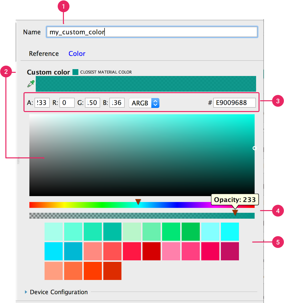
However, I can’t decide how the new layout would be lol.
I made some research on Internet about some layout and UX, and here are some of highlights:
What color representations should we use?
RGB
YUV (Luma is cool, but it may lead to some ‘impossible’ RGB)
HSV / HSB
HSL
The GUI
Color sliders
Show all color components sliders at once (first example below)
User selects one color component slider at a time (third example below)
No Sliders
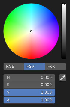
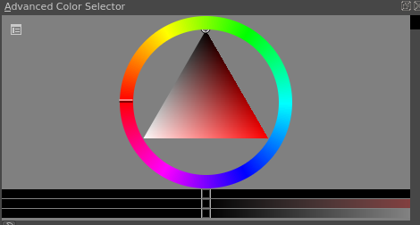
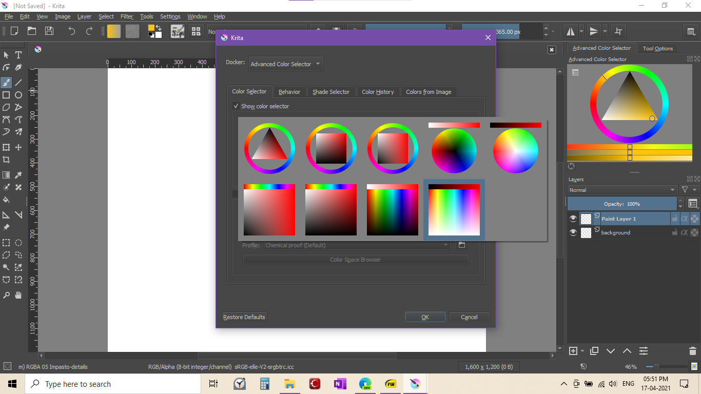
Color Wheel (1st and 2nd pictures) or plane (third picture) or none?
For Color Wheel - the 4th looks simplistic without icons or tabs but just the widgets. Looks like this dialog has both color wheel and slider accessible for all choices.
I vote for the 4th screenshot for The GUI.
For color representations, sadly, I’m not knowledgeable enough to offer my opinions on this.
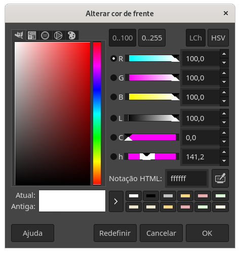
In my gimp the color dialog shows like that only. I didn’t crop.
Well, the main thing is if the color dialog would be docked to the synfig ui, it could reduce the number of clicks required to change the color of layers.
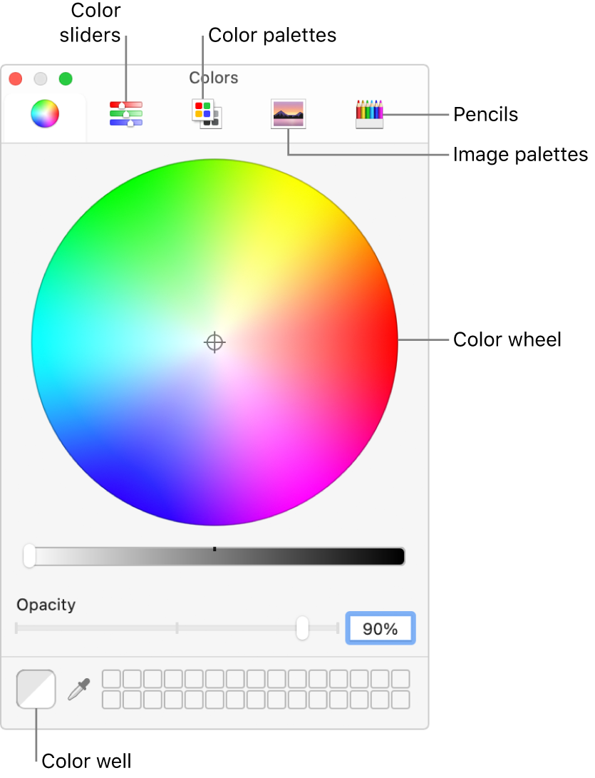
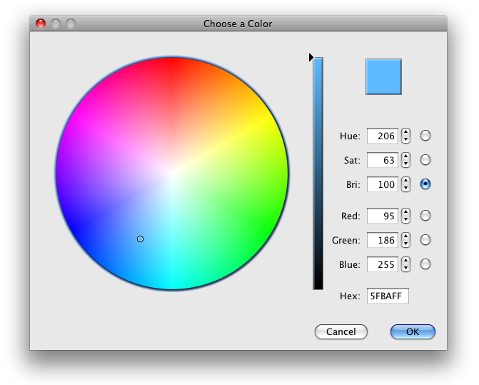
Color wheel
I like the color triangle as well, feels very intuitive (also because it reminds me of Inkscape which I used a lot) and makes the process of finding the right color very quick.
Color sliders
Showing everything is cool but makes the interface quite messy.
What I’m thinking here is that usually (at least for my use case) if I want to use a color representation I won’t be interested in having displayed other representations and their sliders. Maybe showing all the sliders of the currently selected representation could be a good design? So let’s say RGB is selected then only RGB values and sliders are shown, then if HEX is selected only its values and sliders are shown etc.


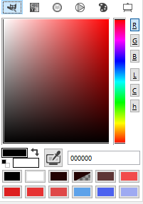 What about this one? This is GIMP’s color editor.