
I used small (text)size, 6pt, for the parameter list, so that it can be show more parameters in a time. now sure it is a good idea or not.
The biggest challenge is Filter Design. There were some discussions on What is the limit for rendered avi and mpg?
Fantastic work again jcome!
I love:
Being able to zoom in and out on the time-line
The fact the parameters line up with stripes on the time-line
Convert, export and Link being buttons on the bottom
Having a sensible number of decimal places (as long as you are still able to use as many as you want)
Being able to add a keyframe from the time-line window
The fact the time-line can scroll left and right
I don’t like:
Not having time units on the time-line
updated now:
- Add time units
- Use “Connect” instead of “Link”, and add a “expand all” button, it is a toggle button, when it toggle on, all sub-items in parameters list will be expanded, it would speed up a bit, particulary for vertices parameter editing.
- Add a preview range flag, used to set the begin/end time of the preview.
- Combine add & remove keyframe buttons, the button is key-sensitive.
- Add a “Pan” button
I’m glad the units are back - thanks! ![]()
You can currently zoom in and out the time line. There are not buttons though.
wiki.synfig.org/wiki/Mouse_Shortcuts
-G

Don’t think about tech thing too much, do you think it is a good idea? For a user’s perspective, will it help on / boost your animation creation?
- it would be easier than current design to link/connect parameters cross layers. To do that we don’t need invite Children panel in this design.
- we can provide a children item in the param list[1]. then we don’t need a extra Children panel while handling “Export”, “Connect”. Say, we can
just drop a param from its original position into Children Row and than it is just exported with a name gave by system, if user prefer a customized
name, s/he goes to the Children Row, double-click that param just exported, rename it.
[1]in the above mockup, I didn’t provide this idea, sorry. But you can rename “Star Layer #1” to “Parameter Children” in your brain  for example.
This design would eventually remove the layer’s panel. Just turn all the parameters show off and you’ll get the layers panel.
If the children panel are listed too in this new concept it will be needed to be able to select more than one parameter on the parameter panel to allow multiple connections at once.
I do miss the Link (and its derivatives) actions on the bottom of the panel. I would want to be able to link two parameters (any of them) without need to export one of them first. That’s now (and in your design) only possible using on screen ducks.
That’s a great idea. Also if the user selects various parameters and drag - drop them over one existing children parameter, then the selected parameters could be linked to the exported one.
Another possible way to handle link/connect/disconnect is to place the children panel side by side to the parameter’s children and show an intermediate area with the connections wires (like blender’s compositor but between two lists). This would allow user to see more visually the linking between parameters. Say that there are four parameters connected to a exported value node. Then there is a line from each parameter that connects the parameters with the exported.
This opens some new ideas by using the drag and drop concept. If there were a trash area on the children panel, the user can drag drop an exported value to the trash and then it is un-exported.
Another idea: When the parameters are linked but none of them is exported then the children panel will show a autonamed value node with italic font (indicating that it is not exported yet). Also the connection lines would be dashed.
In this side by side param panel and children panel concept, each one would have its own vertical scroll widgets and the connection lines would adapt itself to the situation of the scrolls.
Regarding to filter. It is a fantastic idea. I would add another filter: Expert/novice filter. This filter would show the most common used parameters for the layers when expert is off and the full list of parameters when expert is on.
-G
I love the filter concept!
I think it would be useful if we can use several filters at the same time like Origin+Color.
Also perhaps an easy way to set preset filter lists so we can switch to different commonly used filters.
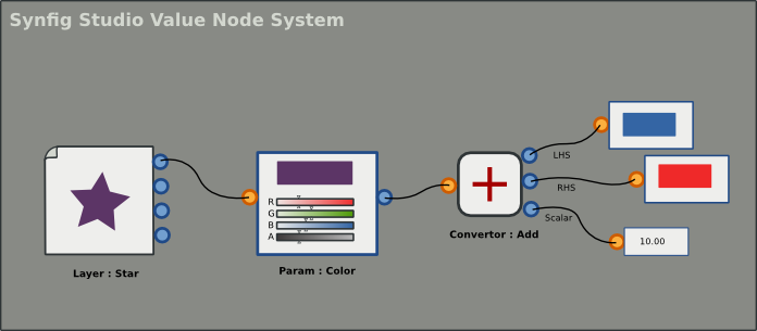
Nice ideas, now I have set up two models for this Value Node System in my mind:
-
a list based interface, that will be an improvement of the current design: layer panel → param panel → children panel, it is ease to learn but with some limitation while handling complex link/connect tasks.
-
the other is Node based interface, with we can provide a powerful tool for user to complete complex link/connect tasks, it is for advanced user (Synfig Studio expert).
That is the way we should go if we start to code this filter. Now we have agreed on some initial designs, and the filters we have now:
a) value type filter
01. bool
02, vector
03, integer
04, color
05, angle
06, list
07, canvas
08, string
09, vertices
10, real
11, time
12, gradient
13, segment
b) status filter
14, animated
15, static (animation forbidden)
16, linked / exported
17, converted
c) name filter
18 text filter ( a string based filter, it can filter multi-items: param name, param value or/and param type)
d) user-defined filters
user-defined filters (user can save his own filters settings). User can enable multiple the basic filters (a - c) at the same time as rylleman mentioned “use several filters at the same time like Origin+Color”.
e) preset filters
19, expert filter
20, novice filter
21, …
We can provide some common preset filters by default.
The layer and children panels combination is not clear at the moment yet, more design effort needed.

And when a parameter and a child are selected at the same time, will be both bold highlighted?
-G
Since we are trying to improve param list with filter syste, it would be great if we can tag a parameter as well, and the Gimp already has both of them. We can apply this to ourlayer panel as well.
seems liblarch is a good choice to implement smarter parameter list (if we are going to implement our UI (Synfig Studio) in Python:
I like that. There are still a lot of params though. I noticed a lot of redundancy when I tried to make a custom valuenode system. You can have a Solid Color layer with the “Straight Onto” blend method above a Region, or you can get the same effect with the Region’s built-in color parameter.
I think the source lines of code could be reduced if the redundencies were eliminated. The Solid Color layer would have two params, blend method and color. Then, the “Region” layer would only have a list of vertices. Then, the group they are in would handle things like blend method and origin. Oh, nevermind, that wouldn’t be intuitive for artists and designers.
The layers themselves remind me of functions, with parameters as time-varying arguments.
skull { // group
    color straight-onto 0.6 0.7 1.0 // blend_method, red, green, blue
    circle 20.0 // radius
    region [ M0,0 L20,0 L20,20 L0,20 C ] // vertex list
}

circle 0.0<#20 9.0 ease-both #40 18.0> // circle with waypoints
Just thinking.
Considering “simplification” of a cluttered UI, a thought occurred to me. The Parameters usually takes up maximum vertical screen-space. Can we move it to the right (much like Blender) where the Layers panel is? The only problem we then encounter is lack of space for Frames panel. We may need to think out-of-the-box to find a convenient solution for it.