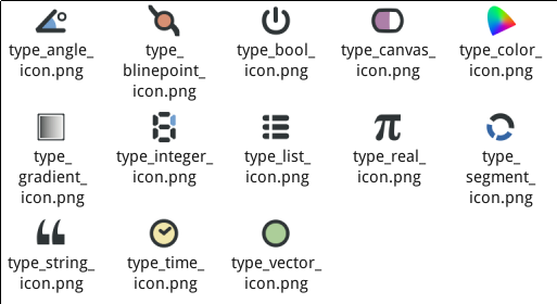
as we can see, in the param panel, except the icon of a parameter, there is a “type” column that points users what type is a parameter. does it make sense if we remove icons from param panel totally? I guess the answer is “No”. Maybe we can do something for icon itself. (actually, it stays in my mind for a long time.) the below is my quick version of symbolized icons of parameters of layers, I draw it yesterday.

PS: the icon of canvas parameter is still missing.
I like all them. Seems that we are going to a b&w-ish icon style what is a good thing for the color blind people.
The type column writes down the type of the parameter and also more information. It will write if the parameter is animated, static or the type of the conversion it has. I don’t think we should remove it unless replace by something similar.
Regarding to the icons, I would like to see what still having old ones and if it is possible to iconize them.
Also if there is any remaining with colors it would be interesting see a b&w version of it.
Good artwork jcome.
-G
I like them all very much!
Perhaps they could be used as monochrome but tinted in colour?
I like them. please just add a light/color outline or shadow otherwise they might not show up on a dark-backgrounded theme.
I made another set for the same purpose, some time ago, in viewtopic.php?p=5301#p5301:
B.
thank you all for your input.
Initially, I intended to have a b&w (grayed) icon set for param only. the rest of the synfig studio icon set will be still the same as they are.
The reason is that when I was using Synfig Studio, I found the content of param panel is not so clear, its icons taking more my attention while I working on Param Panel, but actually, I personal care more about the name of parameter and its value which can directly tell me what they are. Quickly, there are two options bring up in my mind:
1, remove the icons totally,
2, make the icons unified and tune them into grayed (b&w) style.
As Genete mentioned, the first one is not a nice choice. I will try to improve the second proposal:
1, to have metaphors for the rest 3 icons (segment, canvas-pointer and one more)
2, to give a try of a small size, the current size is bigger then the name text size, not sure if this can help to achieve my goal.
3, to give a try according to your inputs above.
4, to touch the code (iconcontroller.cpp) so the parameter type icons can have the same naming scheme as layer icons.
finally, if the community prefer colorized style, I will create a copy based on b&w version. ![]()
–
Definitely colour for the color, gradient, origin, bline point & tangent icons… Should the vertex have a little red box around it? 
Chris
string icon
![]()
4 ur ref
![]()

![]()
![]()
still missing new icon of canvas yet.
Neat!
puting appart that I love those new set of icons, how do they integrate with the current layer icon set?
And the panels icons how would they evolve?
I really love the symbolized icons. Maybe for the layers it is not possible to symbolize at all but it would be awesome to have a set of icons with:
-Less set of colors (the current palette you use is very good, soft but visible, I like it!)
-Easy to distinghish when reduced. Some current layers aren’t
Please, don’t stop working on them. It seems you have good skills there 
-G
btw, the integer icon is a digital number staying in 6, because you know, 0.6x.xx serials 
the attached is png files in 48x48 size, to test it you need git version and the patch. otherwise you have to rename these png files by yourself and then it will replace the gradient tool icon on your toolbox.
btw, the type_canvas_icon( was canvas pointer) icon is depended on the canvas icon, so it maybe changed in the future, and the sif files of these pngs will be uploaded here or committed to patch tracker later.
synfigstudio-icons-types-20100926.tar.bz2 (15 KB)
This reply will cover all the aspects of the current thread and this thread.
Hi jcome,
I start now to work on the release of 0.62.02. It is time to think on collect the information and take some decisions.
I hope you can help me on fill the last missing icons.
First of all I love all those symbolized icon set of parameters and the new tangoished set of layer icons of the other thread. Said that I have to add:
I have some ideas regarding to Canvas, Canvas pointer, Encapsulate and Canvas browse Panel.
Looking to your idea of symbolize the encapsulation I have some ideas:
- Let Canvas icon (in the canvas browse panel) to be as it usually was. You can tangoish it but leave it as a sphere. It might need a new icon stock and the proper changes in the code.
- The Layer Other Paste Canvas Layer and the Canvas Pointer to be the same icon: a pill with a half made of similar color than the canvas sphere and the other half white (if you want it can be light magenta). Leave the 3D brights to the pill of the Paste Canvas and the stylized version for the canvas pointer. But both the same.
- Make the Encapsulate action icon more action. I suggest to be two halves of the pill separated with the bluish sphere in the center and some action lines to simulate the encapsulation.
What do you think?
Some thoughts for the rest of icons:
a) In the next release, both tangent ducks will have the same color. The BLine tool icon and the toogle tangent duck icon should change accordingly. In a further release the red tangents will come back because we plan to distinguish merged tangents from split tangents. But that should be made later.
b) Add to group and remove from group action icons should be modified to match your new Group icon.
c) The palette icon has too many stripes in my opinion. It can be simplified I think.
d) Can you modify the layer_transform_translate icon to use the tango like layer icon you designed?
e) The navigator, the metaballs and plant icons reads much better.
f) The Normal Tool icon, can be improved?
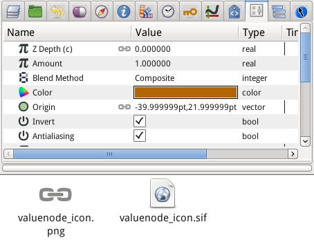
g) There is a valuenode_icon that appears when the parameter is a linked parameter or it has been exported or it has been connected to a previously exported value node. Have you thought on improve it?. Currently it uses the start of the English word “DYNAMIC”.
h) The select_all_child layers could be improved replacing the yellow square by the paste canvas pill and a rounded dashed outline around.
i) The Time track icon, is directly iconized by the clock icon? I think that someone has proposed a film strip like icon somewhere in the forum. Another better iconization of it is based on the waypoints it holds. Also proposed in the forum but not accepted (out of style).
j) Set layer description action icon can use the new layer style if possible.
-G
Genete,
glad to hear that the new release is planned. thanks for your input, It does help a lot on my icon design.
From 1 oct , here in China we will have a long public holiday (seven days), I will take some of it to work on icons. I hope the result will meet the requirement.
The first priority task is to fill those icons you mentioned above. and make tool icons use new naming scheme as layers did. After that I will continue to work on the tango-ish icon set.
for the icon of linked parameters, I already drew one as attached,it is a chain in gray, I am not sure if it (a chain) matches the concept of synfig. And It is not so satisfying me.
btw, this is just a quick reply, more input later when i get more time.
We have the same thought here I think.
agree with you, and an additional thought, do we need to identify the Pasted Canvas Layer and the Inline Canvas with different color shade? the parameters of a pasted layer can not be changed before the referenced file (canvas) is opened. and the inline layer is not in this way, it's parameters can be changed directly. So we have the different color for these two layer icons to info use.
in this case, I had the same thought before. but not sure if it can be still have the contrast after adding details, as we know a icon only get 22x22px. anyway, will give a try.
It shouldn’t be a hard task.
shouldn’t be a hard task.
actually, the new palette icon is copy from GNOME Icon Set (system->preferences->appearance), and simplified already, is it still readable after simplified more? let me try.
in my to-do list already ![]()
they are still in draft/concept stage, will finalized some. also, I drew a new metadata icon as the above attached screenshot shown. the curves icon will have the refresh version as well.
added it to my to-do
see above post.
ok.
yes, it is. but it is just a trail, thanks for the infomations, will look at them. hope I can get some nicer ideas here.
added to my to-do.
The gray chain fits perfectly the concept, I think. Even I think that the icon for the action “Link” can be changed to that.
Great looking of the meta data panel icon.
Thanks for catch up all my requests about icons. This release will be quite good!
-G
hi, just want to update you the status
1, canvas icon – done
2, pasted canvas – done
3, type_canvas – done
4, encapsulate – done
5, bline tool - replace the red tangent duck with yellow – done
6, toogle tangent duck - replace the red tangent duck with yellow – done
7, add to group/remove from group action icon – done
8, palette – done
9, layer transform translate – done
10, normal tool – done
11, valuenode_icon – done
12, select all child could be improved replacing the yellow square by the paste canvas pill and a rounded dashed outline around. – done
[color=green]13, layer description – wip
[color=red]14, time tack – missing , ideas wanted!
[color=green]15, params – wip
16, and the other panel icons – done
17, …
a picture says thousands words ![]()
![]()
finally, got a nice idea already, it is synfig spec one, u will like it im sure. will post once it done later. ![]()
all panel icons are ready for final cleanup job right now, if the time track icon is accepted by the community.
do you like the idea and design of time track? it is based on a waypoint (In: TBC and Out: Ease Out ) and a clock.
![]()