I’m trying to get a realistic moon done in Synfig and got a few problems, any idea is welcome to improve the thing!
The final sequence is planned to become a long quiet shot of clouds hiding/halo-ing the moon that slowly crosses a night sky, while some windmills rythm the wind…and music. silent preview at vimeo.com/56852536
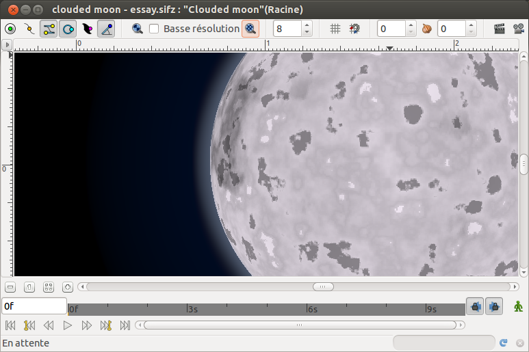
I currenty have the moon done based on a spherized 2 noise layers (various amount and gradients) multiplying a pale colored circle for the planet, with blurred outline as halo.
The current problems I see:
The result is satisfactory at small scale, but not when zoomed. Is there any possibility to have the noise layer make more “rounded” noise, cloud-like? It would help my moon look more like impacts holes.
Due to linked outlines it’s very easy to have any phase of the moon. There’s just a little glitch at each “corner” of the blurred outline that looks like a short bright line, don’t know where this comes from, and it’s not at all bad looking here, but I’m wondering where it comes from.
Feel free to play with the attached source file for any purpose you’d like, and again: any improvement suggestion is welcome. clouded moon - essay - phased.sifz (2.41 KB)
Berteh.
“I’ve not played with the file but coming the composition from you (the realistic fire expert”
OH! that’s you! lol… I was at this very moment making fire that way.
This project, however, I find less convincing. When I look at our moon I expect to see circular craters. My first impulse is just to use an actual map of the moon or one that you’ve traced the major features on. People might call your drawing “a moon”, but no one will call it THE moon. We just all know what it looks like. It has the “face”. The texture of yours is too uniform. Features on the moon are much bigger than on yours.
My suggestion would be to trace some of the most recognizible features of the real moon from a picture and add them into your model.
You technique here makes me think of trying to animate a banded gas planet like Jupiter or Saturn… Hmmmm…
I like it. My suggestion is to slow down the moon or freeze the setting. I think the windmill blades give to the spectator the sense of the real time, while the moon is clearly accelerated. It’s a mind screw!


 ) but I doubt I can improve it too much
