[size=150]Why[/size]
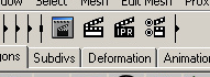
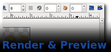
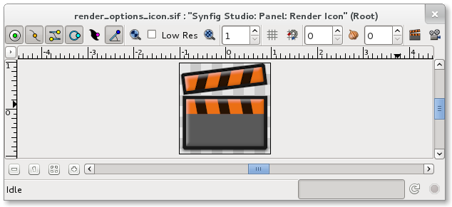
Render and preview icons on the right top of the canvas window are not clear enough for a user to understand and distinguish, there are so many (seven) CIRCLE looking icons staying in canvas window
[size=150]Relevant Artworks
[/size]
[size=150]Proposals[/size]
Here is my proposals of Render and Preview. They are just concepts not the finished works.
Not bad ideas. 99% of clapper boards I’ve seen open from right to left. I would also modify in some way the colors. They doesn’t match with the rest. Maybe they are too saturated for my taste.
-G
Yes, they both look great. They do everything free desktop icons should - they have distinctive outlines, would work in two colours for visually impaired people, they describe their function in a non-cultural specific way
Personally I’d prefer it if the clapper-board had white and black chevrons instead of orange and black but that is very minor!
I’ve been following their development and seen that you put a lot of work into them - well done jcome!
I like your design very much. Especially when the clapper board got grey.
Do they come through clear as what they stand for? Preview and render? Is there a clear line between a projector and preview, clapper board and render?
i know these thoughts should have come a few weeks ago, sorry…
I can’t think of any better analogies than these though.
Before I started these redesign, I researched other animation softwares. Most of (3D) animation applications use clapper board as render symbol including maya, 3dmax, k-3d, blender. But I can’t find a common symbol/icon for Preview function so I took projector as new Preview symbol.
Maybe we can tweak the clapper a bit to have an alter version of it as Preview icon.
And I updated the first post of this topic by adding relavent artworks
Although, as rylleman says, the clapper-board is an imperfect metaphor, jcome is right that it is widely used for render and so would be familiar to many users. The preview icon is very good too - it looks like a simplified Moviola.

 Though of course not precise

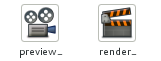
 so I took projector as new Preview symbol.