I want to make icons for Synfig, current ones are cool enough that gave me an idea, all i want to ask is if there are some sort of list of icons for Synfig to use, including those that are yet not made, i write this with time because i would like to make them and finish them before a future development snapshot or maybe a future little update, of course this as an alternative icon pack, is up to the community’s choice if they become the actual main pack
May be this thread?
viewtopic.php?f=14&t=980
-G
=D! that’s exactly what i had in mind, thanks G!
hi Genete or any developer of Synfig, i have some icons already made, they are simple but (i really hope they are) clear, i made icons for actions like save and open and other buttons that uses current system default icons, my question this time is which file do assign the .png files to buttons in Synfig Studio?
Edit:
I started the replacement of most of the icons for Synfig, but i think they actually look thiner than i though, maybe it’s just my imagination but i’ll leave you a screenshot with the first icons replaced, i did not contienued until someone can confirm if ‘bigger’ graphics will be need (quite hard to do)
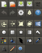
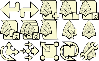
This are only some of the many icons i already made, as i stated before, i did not continued because i note them thiner than in the 128x128, maybe i will have to do different icons now.
The icons path is currently hardcoded and it is created during configuration time at build stage. At the moment, the only way to change the icons for a Synfig Studio already installed, is replace them by other png’s in the place where they were installed. It can be different from one installation to other but in the debian package we provide they are at:
/opt/synfig/share/pixmaps/synfigstudio/.png
In the ubuntu package they are at:
/usr/share/pixmaps/synfigstudio/.png
So it depends on how did you installed the package
-G
i know, as i said before, that’s how i’m replacing icons, but i would like your opinion, current one will work as they do look? if not, perhaps, i will have to find a unique big symbol that represent the current button rater than the action that is capable of.
Hmmm, re-reading your post, are you creating the icons using a sif file for each? (sorry if the question is dumb) Remember that icons are generated at compile time and that we don’t provide any icon image (png) with the source file. Just to be sure ![]()
Regarding to the question of if the icons “works”, I personally would like that all the icons would be consistent in all the application. Our commitment was and still being to match the Tango Libre art set guidelines. So, although your icons are nice, you’re replacing the ones that already have a definition in that art set (i.e. Rotate, or Scale). The idea is that all the Graphic applications under Gnome have the same look and any user can deduce what’s each icon for just by looking the icon image.
It is true that some of the icons are different depending on the desktop theme (the icons grabbed from the theme icons stock) and that it would be ideal that those icons were designed too, using the Tango Libre Art Set guidelines.
I personally don’t have a global vision created on how the icons should be but I think that the gnome consistence is a good way to keep users eyes “unhurted”.
Maybe, instead of create a new the icon set straight forward, we should review the current ones and check its consistence in palette, shadows, proportions and then write Synfig Studio guideline for icons creation. What do you think?
I also would like to hear other users administrators opinion so I don’t feel like the only one who take decisions. Specially this matter should be a user based decision, so all this post is my opinion as user, not as developer or administrator.
-G
Yes, i downloaded the GIT of SynfigStudio, when i checked the whole package and find the whole pack of icons but in.SIF format, inmediatly suspected that PNG icons are generated from them, so i’ve been doing all the work inside Synfig Studio. On this cases my motto is: “It’s the way is made, it’s the way it works”
At this point i can assure you i have a new icon for every button in existence and plus some custom Synfig Studio does not have like the ones for Save, Save as, Save all, Setup, etc, i knew about Gnome apps looking alike, but many users including me do not use Gnome as much as other Desktop Environments, my personal favorite is XFCE4 and the set of icons differ a lot from the ones of gnome as you said, also KDE users might find a little subjective the icons that are placed replacing those from Gnome, i was thinking also in something simple that looked quite formal and dynamic, also with this, making every button more “universal”, i remember some of the tutorials in the old site showing buttons like the Setup button in one way, but actually looking different in current releases at that time for Gnome.
I had my exam period, lot of spare time and nothing to do at all, i would like then make the try taking a look at the Tango Libre Art Set Guidelines closely, i don’t really feel aprehensive to the current ones i made so i can easily work in a new set of them, apart from the Tango alike apps, would you agree if i add bluish color to them? despite stick with TLASG i would like to see at Synfig and see that ‘this suit has it own set of icons’
yeah, that’s what i meant, if an icon takes you more than one look to understand, then that icon will be of no use.
well, i think i should be writing this on the Icons thread XD XD XD, but that sound actually very fine for me.
ah, maybe i should have separate properly the sentence, the call for you or any developer of Synfig was for the thing about the file that assign icons to buttons, since things seems quite a bit complex i did not insisted on that. But i’m more than happy of hear opinion from anyone who feels it have something to say about it.