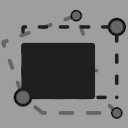
The icon is just a simple 2x2 matrix, cuz you know, transformation is represented by a matrix. I honest to god tried to be fancy and do stuff like this:
But it just doesn’t work when you scale it down to such tiny size. Tried various shapes and colors, dashed outlines and whatnot but all those details are lost when you scale it down, so I decided to go simple. I mean, the icon for origin type is just a green dot, so I guess the complexity is not really needed.
Anyway, feel free to use it (or modify if you don’t like my version), it’s in public domain as the rest of Synfig icons, so no limitations. Here are the sources: type_transformation_icon.sif (16.9 KB) type_transformation_iconC.sif (17.3 KB)
P.S. I know that there’s a new system for icons in discussion (I am against it) but who knows when it will be implemented, so I guess there’s no harm in making missing icons for now.
I know that there’s a new system for icons in discussion (I am against it)
Why to be against the addition of fancy stuff that may introduce new bugs and regressions, instead of spending this time and energy to solve existing ones and focus in usability over cosmetics?
/s
Oh, come on you, it’s not that bad
Basically, people want SVG icons as I heard, so they are actually trying to simplify things for once - SVG would eliminate additional build process when we call synfig to render icons from sif to png.
blackwarthog had a good view and philosophy : it’s not because it worked once that it will work the next time.
About regressions and icons, there is a good example.
Synfig was creating its own icons from .sif with synfig (core) during the compilation (before making synfigstudio, the GUI)
Some of those .sif contains layers/properties that have been removed from the code (are they used? Let’s remove them in the doubt, it looks innocent).
Impossible to generate the (old) icons with the new synfig, crashing the whole thing …
This is the kind of side-effects not visible on a dev’s machine as he already has the icons present on the disk.
Also, we should commit/PR more often to avoid to “overwrite” some code added in new features that could be in concurrency.
Yeah, I agree. I would rephrase “more often” simply as “regularly”. You know, like commit a bunch in the end of each week. Morevnaproject and ice0 are very busy so they usually approve a bunch of commits and then it’s quiet time for a while (sometimes for quite a while).
Currently there are 148 PRs, a lot of them are still waiting for approval/review, they are pretty much forgotten. Maybe Synfig needs a project manager…
Yeah, sure I can. As soon as people decided on the icon version.
I initially wanted to make the icon’s color the same as the current icons for types real and integer, but they are barely visible in dark mode which I suspect the majority of people use. So in the end I decided to make it bright grey.
Here’s one more version that’s still visible in dark mode but has less aggressive grey color: