icon drafts for terms renaming
thank you jcome for these drafts.
Some comments:
- I personally prefer the first alternative for vector (as horizontal layer draws my attention to the right too much).
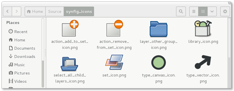
- I would like to see a black icon for canvas type. would be more consistent as all other types are black… how about a ghost (Casper?)… as a canvas is often that: the reflect of something defined elsewhere.
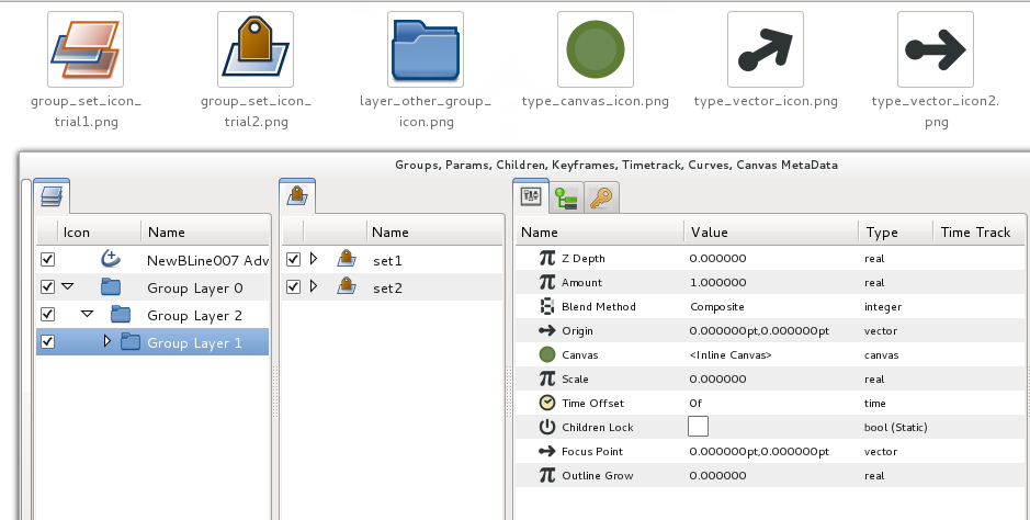
- Maybe a Set can simply be represented by the same icon as a layer_other_group just in a different colour? … would allow not to have an additional icon for what is still the same concept: an abstract envelope/placeholder/pouch/directory.
just a mere opinion though!
Thanks again.
B.
vector, as berteh mentioned, uses the rotated one.
For the library, I like the attached one more that a book shelf.
Hi Yu,
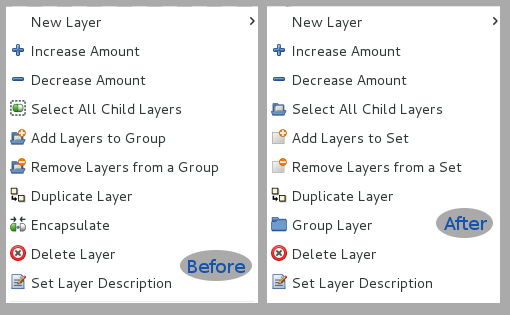
According to renaming chart the “select all child layer” action wasn’t in discussion.
Also, can you please put the old and new icons side by side?
Thanks!
-G
See attached,it seems all of us forgot to mentioned it.
pls ref to screenshots for comparisons.
terms_rework_icons.png