I love Jeff Atwood’s blog, but his child is an mix of great FOSS software and unholy Marketing. Therefore, in the interest of decreasing worldwide rage caused by Discourse usage, and the inevitable but (justified) loss of life that would surely follow, I propose the following changes:
Admin → Settings → Basic Setup → desktop category page style: Subcategories with Featured Topics
Rationale: the categories page confuses by mixing categories with uncategorized lastest posts, and is poorly suited for all the subcategories the forum has
Rationale: new user badges are usually acquired together since they are so easy to get, and make the other notifications hard to see, plus they distract from actually using the forum
The badges to disable are anything that starts with ‘First’, and ‘Editor’ / ‘Reader’ / ‘Wiki editor’
Admin → Settings → Tags → tagging enabled: false
Rationale: I don’t think anyone is actually using tags to browse posts. There are quite a few set, and I usually love tags, but I don’t think they have any use for this forum. Therefore, they just add complexity to the interface.
Admin → Settings → Posting → min topic title length: 8
Rationale: The default is 15, but a meaningful title can be written in much less, and there are even titles from before migrating to Discourse, even by devs, that are a single world
Limit new posts to subcategories only
The Tutorials, Assets & Templates, and Plugins categories should be grouped inside a ‘Resources’ category
For all categories, set ‘Security → create: false’
For all categories, set ‘Settings → Show subcategory list above topics in this category: true’
Document this behavior at ‘Admin → Customize → Text → education.new-topic’
Rationale: this prevents putting posts meant for a subcategory in a category, and if the suggestion above of changing the category layout is followed, this works well with the subcategories being displayed more prominently
Admin → Settings → User Preferences → ‘default other auto track topics after msecs’: never
Rationale: any new user that reads a lot of messages will get spammed with notifications from discussions they are not involved with. If they want to read all new messages there is already a page for that anyway. Users can also restore this behavior in their preferences if they desire
Admin → Settings → Basic Setup → top menu : new / unread to last 2 in the order
Rationale: new and unread only appear if there’s something new or unread, and by default are sandwiched between other items. This makes top menu layout inconsistent. Since the functionality may be useful, instead of disabling them just move the items to the end where they will only harm themselves
Increase edit time limit to a month
Admin → Settings → Posting → post edit time limit: 43200
Rationale: the edit time limit is not documented, so users will encounter this and only will be able to guess why they can’t. It limits spam, so it’s not ideal to disable it, so instead just increase it to 1 month, just like a tl2 user. Edits have a publicly-viewable history, so no information is lost
Rationale: suggested topics are not useful for us most of the time. When you enter a topic, you are directed to the first post, and disabling this allows to scroll all the way down to get to the last message, instead of having to use the visually thin scrollbar to get there precisely
If anyone needs a Discourse instance to try the changes, PM me and I’ll give you the credentials to a trial
Seriously? We are users of Synfig that crashes constantly and breaks your work periodically. We’re all mentally strong here.
For real though, have you considerate that you’re the only one suffering with Discourse interface? Not to be rude of course, but personally I don’t see any major flaw with it (that will cause homicide). The latest posts are very handy to get a quick idea of what is currently discussed, suggested topics is potentially useful that can prevent creating duplicate posts, badges are just a nifty little gimmick that, if you don’t like, is just super easy to ignore.
Other points are more like nitpicks. Oh, and I am in favour of keeping topic title limit to 15 characters. Limit in 8 characters is just too short for a meaningful title. And the fact that devs used a single word for a title doesn’t make it right.
Maybe we should do a poll to get some statistic about how much people like/dislike the current forum interface? As I said, I don’t see any major flaws with the current forum. Definitely better than phpBB that was before.
Apologies for the assumptions, I don’t know what I was thinking
considerate that you’re the only one suffering with Discourse interface
Then everyone else is wrong!
Seriously speaking, I do see the plus in suggested topics, but I think that mostly applies to support forums. For the lastest topics you only have to click the menu on top. Same for almost everything else, they would be fine… for different kind of forum. My impression is that forum regulars got used to all of this, and learn to ignore it. The problem remains, and newcomers are hit with all these issues all at once
I do think certain choices may have more going on than what I see, or that changing things could backfire, but more likely the forum’s were left with the default values, not chosen
I don’t want to push for a pool, but I really appreciate the replies
I am using the forum from my phone, and I gotta say it is less bad than I expected, but still has the same approach of not emphazising subforums
Not to be rude
I have already been rude so if anyone does it to me I’ll take it as karma, plus I must have given the impresion that I’m not taking my meds as scheduled
Why clicking on something if you don’t have to? I don’t see how the latest posts interfere with categories.
You could be right here. Synfig community is tiny, so it is possible we just more acceptable to changes. Any improvement over something old seems like a positive thing even if it’s not implemented in the most correct way possible. Although, I don’t see many newcomers complaining about the usability of the forum, you might be the first one Congratulations! You earned a “First complaint” badge.
The default values are default because it makes sense for them to be default if you know what I am saying
I think, it would have been much better if you could provide a screenshot of how you see the interface. You know, here’s how current interface looks and here’s your proposal. This will give us, the users, some visual clue of changes you’re trying to make. Especially since you seems to know a thing or two about the Discourse engine (I don’t).
Look, BobSynfig just likes poking people with needles and putting them in straightjackets, he’s a nice guy. But the way you write your posts is a bit… unique which could have driven some people away from discussion (and there’s already not much to begin with). I do get angry and over sarcastic sometimes too, so at least I can understand.
I don’t see how the latest posts interfere with categories
The way I see it:
The main page is the category page, and when you load the current category page, you get a list of categories, with a visually small list of subcategories. Next to it there is an uncategorized listing of last posts
Problems
Non-prominence of subcategories. People should be guided to them, and if what they seek does not fit one of them, then you could consider posting in an ‘other’ category/subcategory or (the lesser option) in a general category
Currently the lastest posts in the category page are uncategorized, which does not fit a ‘category’ page. This isn’t as big of a problem as the above, but it’s still inconsistent and therefore confusing for newcomers
Proposal
Change the category page to something like this trial where subcategories are prioritized over categories and the lastest posts are organized per subcategory (or category if there are no subcategories)
Synfig community is tiny […] Any improvement over something old seems like a positive […] You earned a “First complaint” badge
And I want to change that! I want it to explode in size. I don’t want to break the old but good things. I’m proud of that badge
it makes sense for them to be default […] provide a screenshot […] you seems to know a thing or two about the Discourse engine
I agree, I’m sure there is a reason they are the defaults. Besides the screenshot, I’ll also direct you to https://synfigtest.discourse.group (just a trial, will be gone in 10 days or so). Also, all I know about Discourse, I learned in the past week. If anyone wants to mess a bit with that instance and try settings, PM me for the credentials
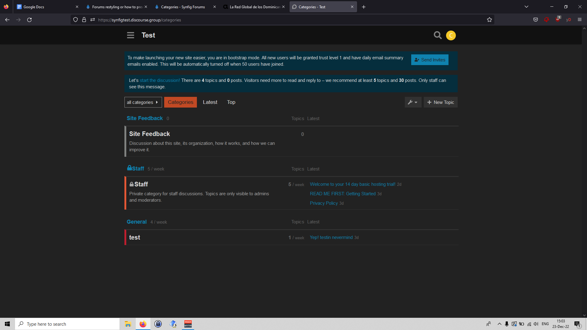
There ‘Site Feedback’ and ‘Staff’ are categories without subcategories, while ‘General’ has the subcategory ‘test’.
BobSynfig […] a nice guy […] the way you write your posts is a bit… unique
BobSynfig is great (I had to resist the impulse to reply to him with a plastic fork meme in another thread ), and I know the way I’m writing is not the most palatable, but I’m hoping that those in a position to make changes look beyond that and choose based on the merit of the ideas, no matter if they end up agreeing with them or not
About screenshot/test site:
You could have left open the test site open or provide test user credentials maybe.
I know that you propose to provide credentials for admin parts but there is surely some of audience would would be curious to see the result
To post only in sub-sections, for sure, would be better
Discourse has the advantage of responsive design but it is heavy…
You could have left open the test site open or provide test user credentials maybe
The reason the site will close is because it’s a free trial account, so I’d have to pay to keep it open, which I don’t see as worthy if it’s just to test a couple things.
I didn’t notice the test site was closed for registrations without invites, it’s now open. Either way, I created test admin and user accounts:
Thanks for the screenshot, I see that it’s not very different but is slightly worse because latest posts in each category doesn’t display the user who last replied. If it did, then it would be more of the same.
Man, I feel like we’re discussing such small, insignificant things. You know what, I don’t have a strong opinion on it, so I am out of the discussion. Maybe someone else will drop some valuable opinions on this topic.
Personally speaking, the only thing I would improve is maybe rearrange categories like so: Artwork, Support, General, Tutorials, Assets and Templates, Plugins, Development, Non-English Forums. Because you want to encourage users to share their artwork first (it’s what Synfig is for, the main goal), if they can’t, they’re obviously looking for help and then everything else. But again, it’s such a small nitpick, insignificant.
I see that it’s not very different but is slightly worse […]
Thanks for the feedback, that’s the kind of opinion I was looking for
the only thing I would improve […]
May be worthy to discuss that too
it’s what Synfig is for, the main goal
Synfig is for visual art, but I think it’s debatable what the forum should prioritize. Maybe it should not be sharing artwork, but getting support. However, from my point of view, priority should lay on development, no development = nothing to support = no artwork. Sure, there is GitHub with an issue tracker, but is that not adequate for all kinds of development-related discussion
I believe details (as insignificant as they may seem) form a path towards a particular goal, and if the path is broken people simply won’t be lead to that goal. That’s why I started with discussing the first thing people see, because the rest of the path doesn’t matter if the beginning is broken.
Anyway, thanks for taking the time to reply even if you don’t think any of this is important
Well as you said this all very subjective. Personally I think Synfig as a whole benefits from having artists use these forums and help each other out so that a community of people interested in the software could be built. After all… what’s the point of a program no matter how shiny it becomes if noone uses it ;).
On a parallel note… I think we could benefit from having a dev chat type thing on a different platform like slack for example.
what’s the point of a program […] if noone uses it
Agreed
dev chat type thing […] slack
Slack is closed source, this is why many projects still use IRC. Most often, devs communicate through e-mail, using mailing lists. It works well in general, but for a visually oriented project like Synfig a forum is likely better
I just realized the minimum twenty characters thing is a bit annoying
I thought about it too, but I had already proposed a lot of changes, and it seemed less annoying than the 15 character limit for titles