Aaaaarhg! More character layout changes!!! 
-G
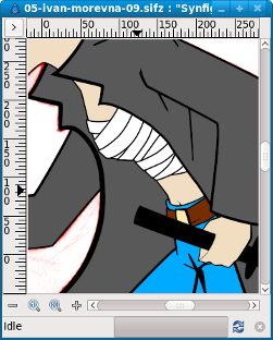
PS: I do like it. Maybe a little wider the bands? (to avoid a mummy look?) (and also easier to animate )
Aaaaarhg! More character layout changes!!!
-G
PS: I do like it. Maybe a little wider the bands? (to avoid a mummy look?) (and also easier to animate )
What are they, these white bands? (Medical) Bandages or some high-fashion top? If they are supposed to be bandages, they should probably be a bit less chaotic. If it is supposed to be a high-fashion top, I have nothing useful to add. (  )
)
G.
Yeah-yeah-yeah. I’m bad. But agree, that’s not significant change. ![]()
Maybe just a little. But I think wide bands will look a bit unrealistic. Though we don’t need to have the same detalisation level on each shot - somewhere (like here) we drawing all bands, but somewhere - just a few lines to outline general look. Like with houses - when we drawing a brick house - we are not drawing every brick. We drawing just a few on the wall or even draw nothing, just filling it with red.
It’s a bandage, but as a apart of a fashion. Bosozoku - mookychick.co.uk/style/bosozoku.php.
I’ve made them a little less chaotic, though.
Note: I’m not trying to exactly copy bosozoku style, just taking elements of it.
Source with some belt area corrections (in git too): 05-ivan-morevna-09.sifz (232 KB)