Asking opinions for a new Color Editor dialog

what about this one? This one looks nice too.

1 Like

Yes, triangle is much better to use from my experience. :slight_smile:

I prefer the plane/square. Others here seems to like the color circle.
Oh my. So difficult XD

Let’s do both and add an option to select the preferred one :wink:
(I am always in favor in letting the choice)

And how we let user choose it?

Krita has multiple choices already.

Oh the programming hell. lol

1 Like

Just some thoughts about the topic:

Color wheel
I like the color triangle as well, feels very intuitive (also because it reminds me of Inkscape which I used a lot) and makes the process of finding the right color very quick.

Color sliders
Showing everything is cool but makes the interface quite messy.
What I’m thinking here is that usually (at least for my use case) if I want to use a color representation I won’t be interested in having displayed other representations and their sliders. Maybe showing all the sliders of the currently selected representation could be a good design? So let’s say RGB is selected then only RGB values and sliders are shown, then if HEX is selected only its values and sliders are shown etc.

Just out of curiosity, any problem with the plane/rectangle/square when comparing with the triangle? @KonstantinDmitriev @FirasH and others :slight_smile:

I think it’s more intuitive for shadowing than by using triangle.

I prefer the triangle because I’ve used it and felt like it’s the simplest solution for the job.

I cannot really give you a specific answer, it’s just a matter of habit.

I’m no color widget expert but here’s what I’ve noticed. Almost all color widgets screenshots you posted above have their own color intensity (saturation and value) slider isolated separately from circle/rectangle which is our color hue.

Whereas the triangle one we see on GTK doesn’t really need additional sliders because the unique color (hue) is the circle enclosing the triangle and each side of the triangle manipulates color intensity.

The Gtk triangle version has a disguised slider lol.
I don’t know if that what they’re fan about it.

The triangle has a weird way to manipulate saturation: you need to follow a curve (someway a ‘parabola’) inside of it…

Anyway, I think there isn’t a consensus. :frowning:

Finally back on this project.

What do you think? What is the best?

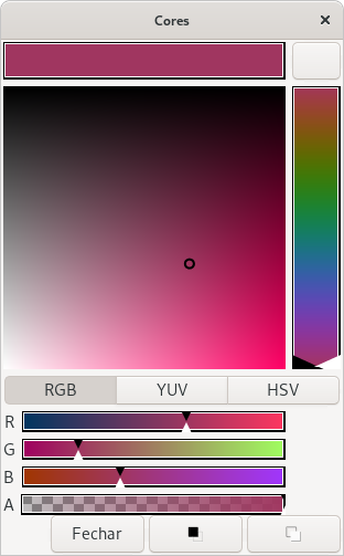
The button on the top-right corner is the EyeDropper (without icon :sweat: )

I still need to place somewhere the Hex entry and the numeric entries for each color component. Any suggestions here?

PS: Yes, I’ll fix the Hue vertical slider

3 Likes

![image|386x297]image
Just adding few more options.

1 Like

What about this layout?
Captura de tela de 2021-08-15 17-59-08

packing vertical vs horizontal hmm… I think your 2nd design would scale a lot better on widescreen monitors 16:9

Yes. That what I thought when I saw the “Waypoint Editor” for color parameters (second picture)
Captura de tela de 2021-08-15 22-10-56

1 Like

How about adding a palette too at the empty place?

Even better how about dynamically generated color palette from the hex value?
javascript - Create Complementary, Triad, and Monochromatic Color palette from single Hex Color - Stack Overflow

1 Like

Color wheel, a color palette generator | Adobe Color