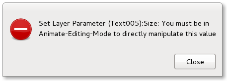
currently , they are not in an unified way, some warning dialog are coded as error dialog for example.
and, I would like to improve it a bit more, following other gtk graphics apps (gimp/inkscape mainly) and the gnome hig documents:
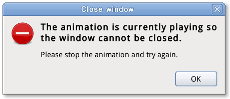
the alerts will be info , question, warning and error. the window title: the “action” that popups this dialog. the primary text: in bold, one sentence summary of the information or suggested action the secondary text: a more in-depth description of the problem and suggested action
Maybe I will take some time to design 4 synfig specified icons for different styles, in synfig studio of couse. I would like to do some artwork design with Synfig Studio again.
yes, not only the dialog style in looking, but also the functionality. For example, why can we just put a “enable animate mode” button atthe dailog to let user just click ONE TIME and go back to creating status with animate mode enabled.
We can polish our synfig with some small changes, small changes makes good improvement
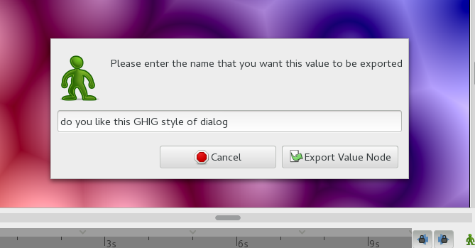
Quotes from GHIG: 1)An alert has a border similar to that of a dialog, and is object modal.
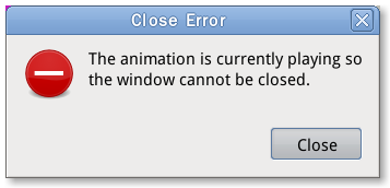
2)Alert windows have no titles, as the title would usually unnecessarily duplicate the alert’s primary text.
This way, users can read and respond to alerts more quickly as there is less visual noise and confounding text.
3)Alert windows are not resizable.
4)Alerts must stay above their parent
If the user needs to resize your alert, the text is probably not concise enough.
Hey jcome!
I back you completely all your proposals here. Please don’t be so hard with me when you find more quick and dirty fixes I might have done in the past with the alert or message dialogs
Keep the good work!
-G
dont worry about it, your inputs and comments are always help me to understand the code and guide me to a right way to fix or improve the app.
Thanks for your encourages as always . my attempt to put these texts here is to obtain suggestion from community, and as a reminder which can push me to implement it.
Then one more encouragement: jcome that would be very nice! (yes I dislike some of the current warning/errors dialog that look meant for developers in a debugging session and not the final user who is interested in solving… not diagnosing. (Genete and others: no harm intended! quick & dirty fix we all know!)
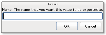
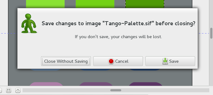
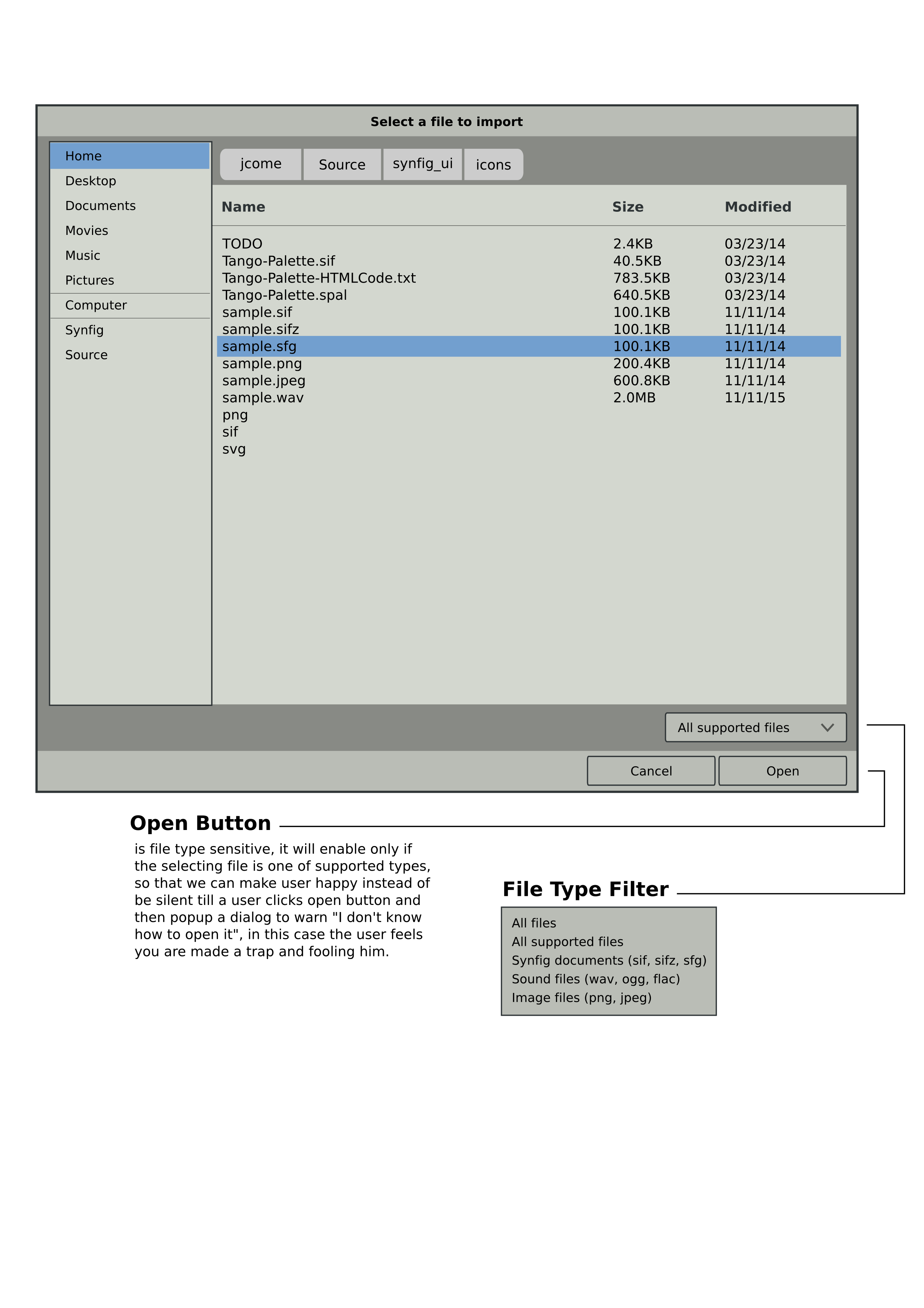
just an example, to for file/canvas colse confirmation dialog, there is not a standard one from Gtk, we have to implement by ourself, and since I am willing/going to design a set of synfig specified Icons for these Dialogues (Alerts) windows, Like Gimp does, so I just pick up icon randomly from our icon library.
BTW, this is a side effect when I read canvasview.cpp and app.cpp code
These look great so far, well done! I agree with removing the titles as the content says the same thing so this is faster to read. You’ve sorted out the buttons putting them the most common way round which is nice.


