# UI Redesign - window system
**URL:** https://forums.synfig.org/t/ui-redesign-window-system/1955
**Category:** Feature discussions
**Created:** [April 12, 2012, 2:12pm UTC](https://forums.synfig.org/t/ui-redesign-window-system/1955 "2012-04-12T14:12:21Z")
**Posts on this page:** 19
**Page:** 1
### Author:  [@jcome](https://forums.synfig.org/u/jcome)
#### Post date: [April 12, 2012, 2:12pm UTC](https://forums.synfig.org/t/ui-redesign-window-system/1955/1 "2012-04-12T14:12:21Z")
- All panels currently we have will become sub-windows,
– they can be embedded or tron off by user.
– all sub-windows get its own toolbar(local toolbar) and title bar. the title bar is not a standard window tile bar, it will have different contents or widgets which are window type relatived.
– a sub-window can be change from current window type to an other synfig window type via [Widnow Type Button]
– I have some ideas here, but would keep it as a secret till I draw them out 🙂
- And the toolbox are replaced by a global toolbar.
– the tools will be re-organized in a good way. some of them will be removed from tooltar, and new ones will be added.
– I have some nice ideas here for global toolbar design together with windows local toolbar in my mind for some time, just keep it till I draw them out 🙂
- The menu in toolbox will be merged into main menu, as a “Syfnig” sub-menu item.
– menu will be re-organized in a nice way.
- The other windows/panels, save file dialog for example, will be the same as they are now, implemented in standard gtkmm widgets.
Is it too blender-like?


---
### Author:  [@DaveJ](https://forums.synfig.org/u/DaveJ)
#### Post date: [April 12, 2012, 3:16pm UTC](https://forums.synfig.org/t/ui-redesign-window-system/1955/2 "2012-04-12T15:16:16Z")
There are many different people doing many different things on many different sorts of hardware, so flexibility is the key thing that I would want in the Synfig interface.
This plan looks very flexible indeed - it’s very exciting stuff!
---
### Author:  [@Genete](https://forums.synfig.org/u/Genete)
#### Post date: [April 12, 2012, 4:16pm UTC](https://forums.synfig.org/t/ui-redesign-window-system/1955/3 "2012-04-12T16:16:48Z")
It looks very promising! I like it all!
> [@](#):
>
> The number of windows can be easily changed by user, all of them can be resized accordingly by dragging its border.
I guess that resize window 4 top border would resize windows 3 in the same amount, right? So in fact which are the two or three areas where windows can lie down? More even, what’s the default behavior when a window is closed? the above/below window takes its space or the left/right one?
Awesome!
-G
---
### Author:  [@rylleman](https://forums.synfig.org/u/rylleman)
#### Post date: [April 13, 2012, 7:47am UTC](https://forums.synfig.org/t/ui-redesign-window-system/1955/4 "2012-04-13T07:47:46Z")
I like it a lot!
Regarding the toolbox/toolbar - Can it be made to be vertical? Nowadays when almost all monitors is wide vertical space is more precious than horizontal.
Also if torn off, will the toolbar become a toolbox or will we have a long bar covering everything else?
Also #2, I would like to have the option of having the toolboxshaped as it is now, as a box.
Also #3, window type button is a dropdown, I don’t like this as it is more clicks to get where you want and you don’t immediately see where you have your windows. I much prefer current behaviour with tabbed icons.
Other that that it looks awesome!
---
### Author:  [@eldruin](https://forums.synfig.org/u/eldruin)
#### Post date: [April 14, 2012, 11:26am UTC](https://forums.synfig.org/t/ui-redesign-window-system/1955/5 "2012-04-14T11:26:41Z")
This looks awesome!! 😃
---
### Author:  [@jcome](https://forums.synfig.org/u/jcome)
#### Post date: [April 16, 2012, 3:21am UTC](https://forums.synfig.org/t/ui-redesign-window-system/1955/6 "2012-04-16T03:21:37Z")
> [@rylleman](#):
>
> I like it a lot!
> Regarding the toolbox/toolbar - Can it be made to be vertical? Nowadays when almost all monitors is wide vertical space is more precious than horizontal.
> Also if torn off, will the toolbar become a toolbox or will we have a long bar covering everything else?
> Also #2, I would like to have the option of having the toolboxshaped as it is now, as a box.
I’m still in trying to figure out a better solution for this.
> [@](#):
>
> Also #3, window type button is a dropdown, I don’t like this as it is more clicks to get where you want and you don’t immediately see where you have your windows. I much prefer current behaviour with tabbed icons.
It is not so clear in my current mockup. The dropdown is a switcher, a window type switcher, with it user can
change current window from a type to an other. All synfig sub-windows(parameters, layers, metadata,
navigator, etc…) will be listed in this dropdown menu. It is smilar to Blender or Toonboom Animate’s design.
---
### Author:  [@rylleman](https://forums.synfig.org/u/rylleman)
#### Post date: [April 16, 2012, 8:40am UTC](https://forums.synfig.org/t/ui-redesign-window-system/1955/7 "2012-04-16T08:40:00Z")
> [@jcome](#):
>
> …It is not so clear in my current mockup. The dropdown is a switcher, a window type switcher, with it user can
> change current window from a type to an other. All synfig sub-windows(parameters, layers, metadata,
> navigator, etc…) will be listed in this dropdown menu. It is smilar to Blender or Toonboom Animate’s design.
Exactly, it is two click instead of one for every time you need to switch tab.
If it works like Blender you mean that the dropdown menu contain all different kind of windows? Then it’s even more work every time you need a different tab, finding it in the dropdown menus.
I much prefer the current system with tabbed icons. It’s fast to switch to desired window.
---
### Author:  [@jcome](https://forums.synfig.org/u/jcome)
#### Post date: [April 16, 2012, 9:14am UTC](https://forums.synfig.org/t/ui-redesign-window-system/1955/8 "2012-04-16T09:14:10Z")
yes, my initial idea is put all kind of windows
in a one dropdown menu.
I am not sure how frequent a synfig user
switch windows/panels in his daily creation
job. Toonboom animate seems adopt a
mbination of blender and synfig ways. Maybe
we should go that way.
---
### Author:  [@DaveJ](https://forums.synfig.org/u/DaveJ)
#### Post date: [April 16, 2012, 9:20am UTC](https://forums.synfig.org/t/ui-redesign-window-system/1955/9 "2012-04-16T09:20:54Z")
I can see what rylleman is thinking here - the thing about animation is that you have to do things repeatedly. Particularly when animating frame by frame. Therefore an extra click which would be trivial in Blender could create a lot of extra work for someone producing an animation in Synfig Studio.
Perhaps one thing you could do is to collect some screencasts of yourself and some other people using Synfig to make a typical animation and then looking at what they click and how often. That would give you some kind of idea of what needs to be available most easily in the UI.
Mind you, that might be a stupid idea - I don’t know anything about designing a UI!
---
### Author:  [@rylleman](https://forums.synfig.org/u/rylleman)
#### Post date: [April 16, 2012, 7:54pm UTC](https://forums.synfig.org/t/ui-redesign-window-system/1955/10 "2012-04-16T19:54:47Z")
> [@jcome](#):
>
> …
> I am not sure how frequent a synfig user
> switch windows/panels in his daily creation
> job. Toonboom animate seems adopt a
> mbination of blender and synfig ways. Maybe
> we should go that way.
I’d think it’s more often than you think. Workspace is limited so we can’t have all desired windows open at the same time, unless we are animating stamps. Switching should be easy and fast. In blender the different windows is used in different scenarios, a handful for animating, a handful for composition etc. so we can have all necessary windows open at the same time. In Synfig all windows can be used together and they are not easily separated into different tasks.
I haven’t used Toonboom so I don’t know how it works there (they don’t have a linux version).
> [@DaveJ](#):
>
> I can see what rylleman is thinking here - the thing about animation is that you have to do things repeatedly. Particularly when animating frame by frame. Therefore an extra click which would be trivial in Blender could create a lot of extra work for someone producing an animation in Synfig Studio.
> …
Exactly my point. We should always strive for easier use, less clicks, faster workflow. Taking out the tabs seems counterproductive to me. Otherwise I think the suggested UI looks great!
---
### Author:  [@jcome](https://forums.synfig.org/u/jcome)
#### Post date: [April 17, 2012, 10:26am UTC](https://forums.synfig.org/t/ui-redesign-window-system/1955/11 "2012-04-17T10:26:15Z")
> [@](#):
>
> We should always strive for easier use, less clicks, faster workflow.
How about using a set of keyboard shortcuts to switch windows/tabs? for examples:
`[F1]-->Canvas Window
[F2]-->Layer Window
[F3]-->TimeTracker Window
...`
And these shortcuts are fully customizable in a clear UI.
> [@](#):
>
> Taking out the tabs seems counterproductive to me.
I get your point here. Let me update my mockup later on tonight. I will take advantage of Toonboom Anomate’s design. My only concern for using tab is it eats quite a lot spaces, specially in some small size sub-windows/panels. That causes some difficulty for user while play with them. For example, if user put
more than 4 tabs(sub-windows) in “Win 3” in above mockup, the Local Titlebar will overloaded and cluttered.
---
### Author:  [@jcome](https://forums.synfig.org/u/jcome)
#### Post date: [April 17, 2012, 11:19pm UTC](https://forums.synfig.org/t/ui-redesign-window-system/1955/12 "2012-04-17T23:19:58Z")
Relevant Designs:
Toonboom Animate Pro
it is a combination of traditional TAB and Blender-like Drop-down designs:
you can add a tab by click the dropdown menu and select the title. when the title you selected is already existing in UI, this user action will bring up that tab, at the same time the focus of input device will be switched to as well.
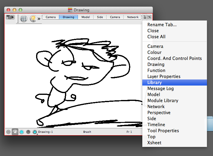
# Pros and Cons
This design is clear and friendly, and it is intuitive so that a new user doesn’t need to take time to learn howto use.
but still, when the (width) size of window scale down to a certain size, it becomes clutter and not so user friendly, and it takes a lot of spaces:
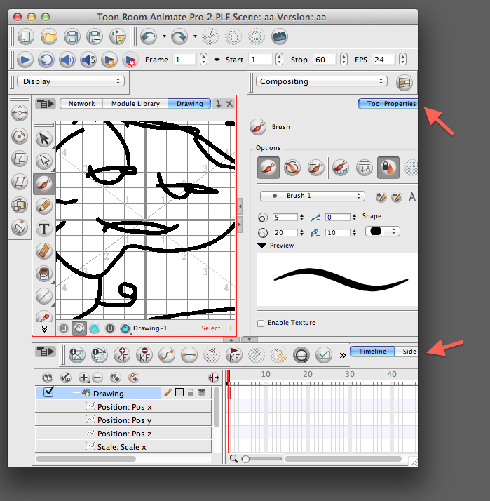
---
### Author:  [@jcome](https://forums.synfig.org/u/jcome)
#### Post date: [April 18, 2012, 3:33pm UTC](https://forums.synfig.org/t/ui-redesign-window-system/1955/13 "2012-04-18T15:33:40Z")
Hi rylleman and others,
Thanks very much for your inputs and explainations, all of them were/are/will help this UI/UX design.
But I think this UI/UX redesign is a big job, we can not make it happen in a short term.
When I get the better soultion for the above issues (tabs switching, for example) I will update my mouckups
accordingly, but before that, I will continue to my design process by filling up the rest parts
of Synfig Studio. so that we can based on them to discuss and collect the infomations from our community,
to gerenate a full picture for the next gerenation UI before our develops start to code it.
Thanks very much for your help!
---
### Author:  [@jcome](https://forums.synfig.org/u/jcome)
#### Post date: [April 18, 2012, 4:39pm UTC](https://forums.synfig.org/t/ui-redesign-window-system/1955/14 "2012-04-18T16:39:05Z")
> [@jcome](#):
>
> > [@rylleman](#):
> >
> > I like it a lot!
> > Regarding the toolbox/toolbar - Can it be made to be vertical? Nowadays when almost all monitors is wide vertical space is more precious than horizontal.
> > Also if torn off, will the toolbar become a toolbox or will we have a long bar covering everything else?
> > Also #2, I would like to have the option of having the toolboxshaped as it is now, as a box.
>
> I’m still in trying to figure out a better solution for this.
Add a new window type: toolbox. you can customize the tools in this tool box in a easy way. and as other windows, the toolbox window can be a floating window as well.
---
### Author:  [@jcome](https://forums.synfig.org/u/jcome)
#### Post date: [April 22, 2012, 3:31pm UTC](https://forums.synfig.org/t/ui-redesign-window-system/1955/15 "2012-04-22T15:31:23Z")
add layer filter widget for layer window and a window management menu, see the image in the first post
Edited 2013.0119:layer window design has been splited to [another post](http://www.synfig.org/forums/viewtopic.php?f=14&t=3612)
---
### Author:  [@jcome](https://forums.synfig.org/u/jcome)
#### Post date: [April 22, 2012, 3:39pm UTC](https://forums.synfig.org/t/ui-redesign-window-system/1955/16 "2012-04-22T15:39:13Z")
> [@jcome](#):
>
> a window management menu
The WM menu should be integrated with Window Type Menu, so that we can have more space on local titlebar to host widget like “Layer Filter”.
---
### Author:  [@jcome](https://forums.synfig.org/u/jcome)
#### Post date: [April 30, 2012, 5:30am UTC](https://forums.synfig.org/t/ui-redesign-window-system/1955/17 "2012-04-30T05:30:53Z")
> [@jcome](#):
>
> > [@jcome](#):
> >
> > a window management menu
>
> The WM menu should be integrated with Window Type Menu, so that we can
> have more space on local titlebar to host widget like “Layer Filter”.
Done, and the mockup updated, see the first post in this thread.
(Ok, for better experience and reference while discuss, I link the local titlebar design here below as well)

#1 : user can split (horizontally or vertically) current window into 2 windows,
and then s/he can switch one of these two window into the one s/he prefers
by the window types dropdown list or an accelerator key (F1~F12, for instance).
#2: user can use the method provided in #1 or s/he can simply: fire up
the window type list menu, and move the pointer
to one of the items and click one of those three icons(buttons), to split current
window with the window type s/he prefers, or tear off the current window.
---
### Author:  [@Genete](https://forums.synfig.org/u/Genete)
#### Post date: [April 30, 2012, 6:38am UTC](https://forums.synfig.org/t/ui-redesign-window-system/1955/18 "2012-04-30T06:38:18Z")
Would it be possible to have several canvases windows of the same document? If so, would they:
1. Share the same time or different time, on each window?
2. Share the same zoom, pan and rotation or different, on each window?
We should consider include a camera view / design view (toggle option) that might be useful to be have in each canvas window, so one canvas window can be used as camera view and other as design view). A built in camera would be great.
-G
---
### Author:  [@jcome](https://forums.synfig.org/u/jcome)
#### Post date: [April 30, 2012, 7:03am UTC](https://forums.synfig.org/t/ui-redesign-window-system/1955/19 "2012-04-30T07:03:19Z")
> [@Genete](#):
>
> Would it be possible to have several canvases windows of the same document? If so, would they:
>
> 1. Share the same time or different time, on each window?
> 2. Share the same zoom, pan and rotation or different, on each window?
Designing multiple document interface for Synfig Studio is not an easy task:
The parameters panel and time track panel eat too many spaces. If we provide parameters and time track panels (widgets) for each opened docuemnt, there will be small space left for artwork content. I don’t
have any good idea currently in my mind.
The solution currently I have is:
Parameters and Timetrack Panels(windows) are separated from document/canvas window, and they are linked to the document/canvas window currently activated, and only one document/canvas can be have activated status in a time.
So time for different document/canvas is different.
zoom, rotate, pan, and ducks toggle status, guideline etc. are localized, that means they are different in different docuemnt/canvas window. (The question brings up here is: should we save these status in sifz documents). For Local Toolbar conpects, see the [canvas window design](https://forums.synfig.org/t/ui-redesign-canvas-window/1975/1) and [layer window design](https://forums.synfig.org/t/ui-redesign-layer-window/1973/1)
> [@](#):
>
> We should consider include a camera view / design view (toggle option) that might be useful to be have in each canvas window, so one canvas window can be used as camera view and other as design view). A built in camera would be great.
>
> -G
good idea.