I’ve noticed that the latest master have changed the toolbox defaults layout.
I think that the icons and widgets could use more free space in the new version.
What do you think?
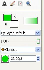
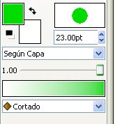
NOTE: the old version is in Spanish, that’s the reason for the wider size (because there are blend methods that has a longer translated string in Spanish than in English)
-G
All creation tools has their own Blend, Opacity and Brush Size widgets available in tool options panel now. all these default widgets will be removed from Toolbox once the Interpolation Dropdown finds its way home (properly in TimeTrack Panel).
And the Outline/Fill Color and Gradient Widgets are in two-tool-buttons width, maybe both will be able to attached vertically so that the toolbox can be resized in two-column width. In this way, we will same a lot of screen space since canvas window uses most of screen in vertical orientation. This is one of the reasons to have a more compact widgets (outline/fill color and gradient).
Even further, the outline/fill color and gradient will be placed in an enhanced color palette panel in the near feature. The Toolbox will be flexible and user can resize and place it vertically or horizontally