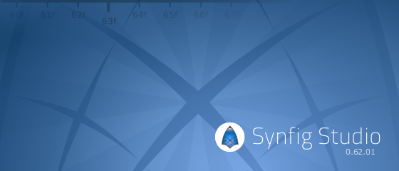
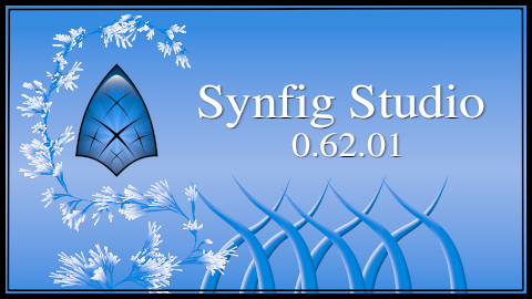
Dual splash screen? I vote for ship both splashes and select one of them randomly at start up. Alternatives?
BTW, congratulations mad0 and Zelgadis!
-G
I agree on a redesign of the texts but also agree on that the diversity makes Synfig unique!
A second pool may bore the people who voted. Considering the small amount of votes of the pool.
My suggestion is:
Zelgadis and mad0: agree some sort of unified text design and place them in the entries. You have one week. If no agreement the entries will go as they are now. [size=50]My last word.[/size]
Mad0:
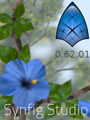
It’s not ok to use my text over your splash, because it will cover flower - that’s not good. Maybe use same text but in different positions, keeping the same style? But the best is to use same text position and style on both splashes. Color probably will be different.
Hello Zelgadis,
I have done a test with your letters. This is not very bad, but not very good either.
But letters that I used would not be ok with your picture.
another idea?
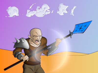
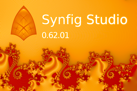
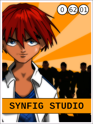
I know it’s subtly incorporated in Ivan’s shirt and in the background, but it looks like the Synfig shield is missing from Zelgadis’ picture, especially when compared side by side with mad0’s. Of course the blue shield may look a bit jarring in the orange picture - how would the synfig shield look in orange?
I like the idea of multi/random splash, and those 2 complement each other very nicely.
Regarding Pixelgeek’s last comment I think it doesn’t matter if the logo is a bit hidden in Ivan’s picture,
it’s more subtle, all the more with a second-complementary splash with a fat full logo in it.