It’s been nearly 6 months since the last release. Time for another one! And if we’re going to make a new release, we need a new splash screen to differentiate it.
Same rules as last time -
I’m thinking it should be a still image, just in case the code isn’t ready for an animated one, and also because studio doesn’t start that slowly.
No particular theme or size, let those artist imaginations flourish! It should probably include the words “synfig studio” and maybe include the logo or remind folks of the logo. You may want to search through the IRC/list/wiki/etc archives and find a joke or recurring theme for inspiration. Perhaps try to keep it smallish - around 300x400 like the gimp one.
The chosen splash must be either public domain or licensed under the GPL-2 (with “or later” option). It must also come with full source code - so we can modify & render it if needed. It must all be created in synfig, no dependencies on external images created in other applications, nor special fonts.
Questions, suggestions, etc are welcome. Happy drawing!
I love the current splash too, but the idea of doing this is so that artists can contribute to Synfig too and also to have a new look for each release. We stole the idea from the GIMP and I think it is a good one.
Last time we cut the challenge off a week before the release. So I think we should aim to close the contest on the September 28th so we can have a week-long poll about it.
Just a suggestion for your splash genete :
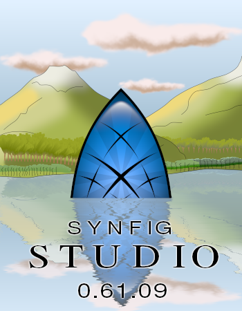
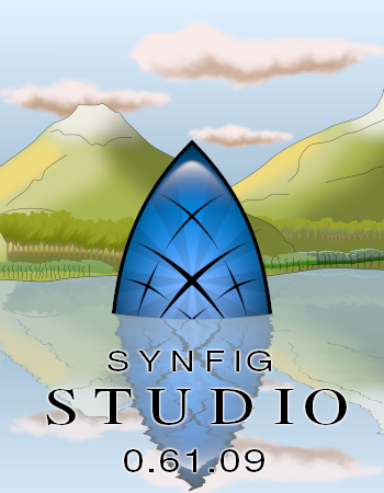
make the bottom of the logo slightly curved (where it touch the water). Because the light effect on the logo makes it looks slightly “bumped”, but the straight line on the water suggest it is totaly flat.
I’m not sure it’ll give a good result, but it may be worth a try
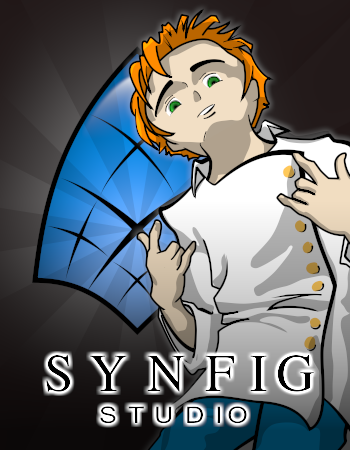
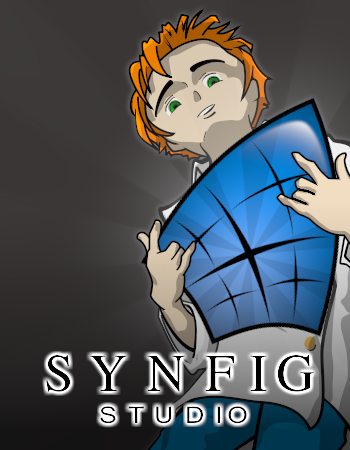
Zelgadis it looks very good! I prefer the second one to be more centered. The lateral position of Ivan distract me so much. And I miss some shadows over the shield from his hands. It is difficult to draw anything onto synfig logo, though.
Doesn’t matter if I am - this was only a bit of fun.
EDIT: Due to either a bug or my own incompetence, I couldn’t change the font or text weight; Just imagine that the letters look like Genete’s or Zelgadis’s ^_~
RE-EDIT: Cheers, Zelgadis. Fixed the font but not the text width, so it still looks a little scraggy. synfig squid1.sifz (12.4 KB)
Hi friends,
here are some proposals for the splash.
It is based on the characters of Cut the Circle (Ariel and his friends of childhood), the first open movie made with Synfig Studio that won the 1st prize in the SELF Project Video Contest. As a way to “celebrate” and promote the short movie, I thought that it would be a good idea that next Synfig version its based on the movie style (as Blender project use to do when they release a new open movie. For example, Blender current version shows “Big Buck Bunny” characters).
So Genete and me (both involved in CTC) created this splash:
Genete, I not sure about the composition of second - it was just a fast-and dirty try. But I like the not-centered compositions. Maybe I should place semi-transparent version number on the left to feel the free space… Shadows on the logo could be done easily though.
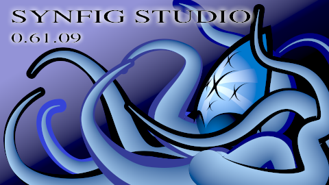
evilkillerfiggin:
Whoa… Synfig in tentacles…
Yaco, I like your entry!
One suggestion: Is it possible to make the characters more contrast? (Maybe add a black outlines? Rocket looks more crisp than characters, cause it has outlines.)
And second (not important, could be easily fixed) shadows should be uniform, even in the areas where they overlap each other, cause we have a single light source.