
for more details,ps ref to: viewtopic.php?f=14&t=3013
Looks like you have achieved the first step of your plan 
-G
Ok, after hard work on my business today I decided to spend some time to make this task a little bit progress so that I can have a rest from my job 
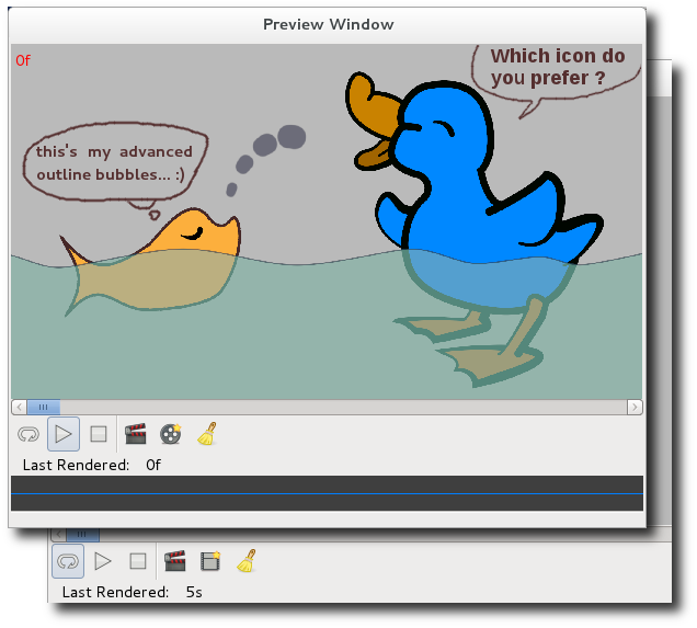
these are two prototypes for re-preview button on preview window, I have no idea which one I will take as final design, could you help me
A: 
B: 
what their looking is in real world? see screenshots.
They both look very good but wouldn’t it be more logical if the repreview icon is the same as the preview icon but with an indication of a new render (your star)?
(Sorry for always chiming in with a “but”)
In my opinion, the button doesn’t just re-preview (which would be the sum of clean and render). It also shows the preview settings dialog so I think that the icon should be like the set properties one:

Remember to try to use existing icons on the stock to not populate with new icons for same metaphors actions.
-G
The only reason to propose a new icon for re-preview button is that the current one is not so clear.
And the stop, halt render icons are confusing too.
According to my plan, I hope I can introduce a nice proposal for preview window finally, but at this moment, I still struggling with C++/gtkmm etc… So I would like to make this improvement (I hope it will be a nice improvement) step by step. If my progress goes well, there will be not separated buttons for play/stop and render/halt render/re-preview.
Take a look at the play/stop button on the canvas window, there is not reason that we can not use the same design for preview window. Btw, I also planed that the stop icon should be replaced with pause icon, try to fire up a movie player app, you will find that is more common design.
Since we talk about the play/stop design, we should also pay attention to the Animate Mode On/Off button. Do you see what I mean? yes, the animate mode on/off uses a different logic for icons usage. The Animate Mode is logical I think. But since most movie players application in the world use the “wrong” logic for play/pause/stop icons and everybody thinks it is correct, then we have to adopt it too. Why we can accept the “wrong” play/pause/stop design? The important is that while you watching a movie, the movie itself is already a “INDICATOR” that indicates your what the status is, playing, stopped, paused. so the user will not be misleading by the icon of the button. But for the Animate Mode On/Off button, we cannot apply the same “wrong” design, we have to use most common design – icon of a button is a CURRENT STATUS indicator not a NEXT STATUS indicator. To understand it more clear, take a look at the Toolbox and the buttons at the top of canvas window.
Another popular “wrong” design is web browsers in the world. Quite similar to movie players, web browser always have one or more indicator to indicate its status. So it is fine for web browsers to to have this “wrong” design 
Actually it doesn’t matter which is logical or not, from my point of view, the most important thing in UI/UX design is consistence.
Ok back to the topic, I don’t think the edit metaphor is suitable for re-preview. re-preview in fact is re-generate a NEW preview (possible) with different settings. In my personal opinion, the NEW icon is better one this is the initial idea of those two icons I posted above.
I will give it a try. I was afraid it will make the icon too complex by adding indication to the preview icon, then I came up with the part of the preview icon as A. And after that, I got the idea: the re-preview is similar to New File… 
never mind, your inputs is always import for me and helped/help me a lot .
Yes, that is correct. in this case we have to reinvent the wheel to make Stop can be distinguished from Halt Render easily 
Still struggling on Halt Render icon
I perfectly can understand that. My advice is to first define the actions and the user interface and later take care on the icons which will be created based on the final action they do.
I wish you the best of luck with the exploring of C++/gtkmm. You can find a lot of help on gtkmm mailing lists. The people there are very friendly and helpful.
Remember that, although my gtkmm knowledge is somehow limited, I could help you on some questions you might have.
-G
Thanks.
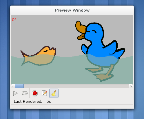
The step 1 of my plan:
is done now:
live demo, adobe flash player required (Sorry, that website is in Chinese):
player.youku.com/player.php/sid/ … NjEy/v.swf
hope you like it.
I can’t see the video:
网络连接出错,请稍后再试
Anyway, the screenshot looks great!
-G
It says: network connection error, pls try again latter.
How about this link v.youku.com/v_show/id_XMzI1NjE1NjEy.html
It doesn’t end loading… 
-G
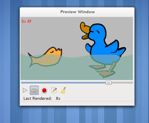
Another tiny step: Time Slider (gtkmm scale instead of scrollbar widget)
Sorry, I am spamming this thread. 
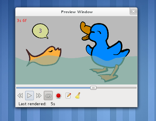
replace dialog with normal window, the close button in GNOME 3 is back now
Todo1: recall [esc] key functionality
Todo2: add spaces between the two button groups
What fantastic service you get around here! A thousand thanks - that’s great! 
Thanks DaveJ
To make the button groups more distinguishable, I tried withe spaces and vertical line separators. personally, I prefer the left one in the attached image.
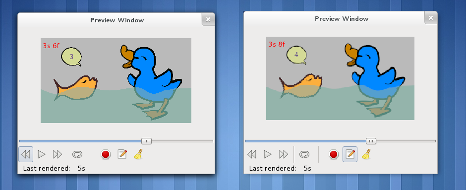
Yes, the one on the left is the best for me too.
scroll-able preview window ,
next step, add a set of zoom in/out tools.
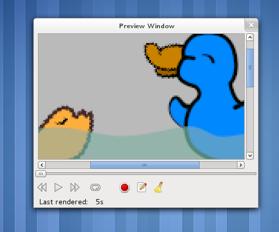
Scrollable! wooohooo! \o/
-G