Hello,
I hereby propose to change the color of the Gradient editor triangles based on the Luma of the color behind, to solve the issue explained in wiki.synfig.org/wiki/Dev:Wish_li … ys_visible
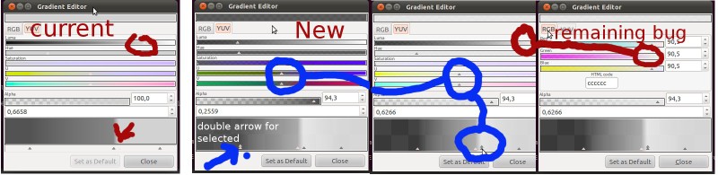
I illustrate the issues I try to solve in the screenshot below, where, in the current situation, some triangle is barely visible (circled red) or totally invisible (bottom red arrow) depending on your colour scheme (default Ubuntu in this illustration). My patch switches the state of the arrow (selected<->active) to use different colors from the current style, depending on the Luma factor of the color: circled in blue is the same gradient, the arrows color change depending on the selected CPoint).
To make the interface more homogeneous I brought the triangles on top of the gradient (they were below), and doubled the selected one so that it would show. You may not like/appreciate this last change… just let me know! I’m here for discussion
A remaining bug: the Luma and Green ColorSliders triangles do not adapt as do all others. I don’t know why, they don’t seem to be treated differently by the “redraw” method. Any help on spotting my mistake is welcome. I’ll keep looking and will update the patch accordingly.
A remaining needed improvement: detect which color of the current GtkStyle is the darkest and lightest, preferably between those of the states ACTIVE and SELECTED. I don’t know GTK enough to do this efficiently, any idea/pointer?
Inkscape uses black arrows with a thin white outline - that ensures the arrows are always visible regardless of the background they are displayed against. I think this would be the best way to solve the visibility problem.
I really like the idea of a double arrow to show the currently selected - that makes things much clearer.
The only thing that I can think on is that they are treated differently on the gradient dialogue. Maybe take a look to it could help to find a difference.
The white arrow with a black contour is a good idea also (more simple) and should work for any color/gradient widget.
I’ve taken a look to the patch and have found why the sliders doesn’t change properly for the green and luma sliders. The ‘color’ variable you use is modified for each color slider type that is redrawn. If you add one copy of the color at the set_color member and use the copied color luma, the patch works perfect.
I’ll send a patch addition if you don’t figure out how to do it.
Nice catch.
I spotted that variable being reinitialised, but could not understand the side effects well enough. I guess my OO skill is a bit rusty
Thanks for reworking my initial patch.
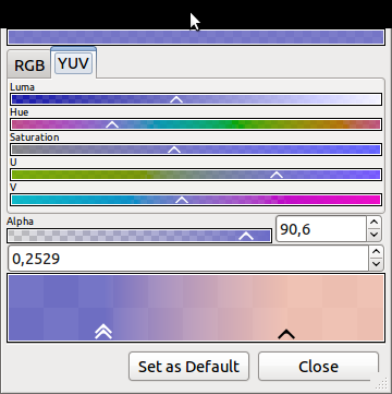
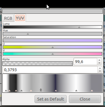
By the way I tested it out with various themes, and it definitely looks better than plain white+black, as it uses the theme specificities, such as in the attached “clearlooks” theme screenshot… I’d therefore advice against using static colors in your code (such as the current black + white rectangle around the color slider to make sure its contrast with dialog background is no issue) but to try to find the darkest and lightest colors from the theme and use these instead.
If anyone can point me the best way to get a light and dark color from the current gtk theme I’d be happy to give it a try… later
B.
I’m worried if I was using a gradient with lots of black or white in it how useful the arrows Berteh’s screenshot would be.
I think making the arrows visible at all times is the key thing to ensure on this dialog. You can do it like jcome has suggested, by placing the arrows outside of the swatches, or do it by making the arrows have thin outlines in a contrasting colour and use the theme colours. It really doesn’t matter as long as it works!
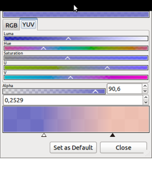
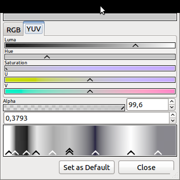
The purpose of this patch is actually to solve exactly this issue, so I hope it does (see attached screenshot with lot of B&W in gradient, and how the arrows always have a color that contrasts with the underlying tone?)… and the sliders arrows have the same color as their CPoint, pick another CPoint, the arrows color may all change to remain visible.
If you believe you have a pretty difficult gradient, attach a sif file with it here, I’ll test it out for you.
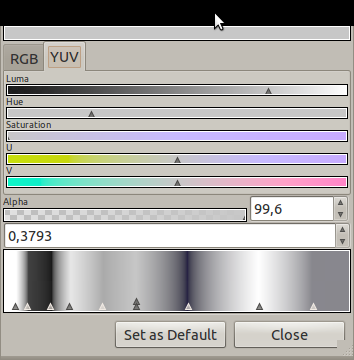
The worst case arrow is (to me) the 5th in “ambiance” screenshot, where the LUMA of the color is close to the threshold to switching to arrow color… but even in this worst case the arrow remains visible whereas is was not the case at all before (see screenshot in first post in this topic).
You sure may! I happen to prefer it the other way as to make the interface more homogeneous. Back to the former situation is easy, if needed.