tooloptions window for creation tools( Circle, Rectangle, Polygon, Gradient, Star, Draw, Spline, Text and Brush(bitmap))

Good solution!
-G
-
did opacity / size will be still shared (ie, global) even placed in tool option panel ? (like gimp do for brush & brush size )
i think it’s could be has important has global background and foreground colors during artwork construction.
(sorry to re-open a discussion already done in the synfig-dev-list … but sometime i need time to think )
) -
where do yu (oups… very bad humor) plan to move “defaut interpolation” ? in the toolbar ?
That is not-decided yet. Not sure which is the better choice. Shared opacity/size settings between those creation tools is the current behavior. But if in new design, these two widgets will be placed into their own ToolOption Panel, it is logical to have non-shared implementation as Blend Method does.
The Fill/Outline Color and Gradient widgets would be placed in Color Palette Panel. I have some other ideas to improve Color Palette Panel. For example, We can have a system default color palette which contains color chars such as tango palette, and a color palette which contains all colors used in the current project that user is working on it. Each color/gradient has its name, it can be called by type it in color/gradient parameter field of Parameter Panel. When we edit/change a color/gradient in Color Palette, all parameters linked to this color/gradient will be updated as well. Of course, the project color palette can add as many new colors/gradients as use expected, but we will also provide a button, saying “Cleanup”, to delete all unused in the project.
It is good to have more discussion since I am not using Synfig Studio in a professional way as most artist. ![]()
How about placing it to Time Track Panel (and Keyframe Panel)? Currently, The Default Interpolation widget in Toolbox is for waypoint only, it doesn’t affect keyframe generation.
Hello:
I’m ok with using icons, instead of check boxes with text, when using drawing creation tools. I would be better if, when the mouse is over one of them, a explicative text appears, like “Create a region”, “Create a stroke”, etc.
About the tools panel, i have an observation: the pencil icon is been used twice for differente tools, allthough, with different colors. I think it may be confusing. I think the second icon (the yellow), is for the raster-brush tool recently added. It’s hard for me to think in other icon; Maybe an old brush, Or a pixelated tracing?
Do we need the old sketch tool now when we have proper brushes? The functionality is somewhat different but there is better ways* to archive this and it is confusing to new users to have a pen that you actually can’t use in your animations.
- Annotation tools. I use Gromit MPX to get this across my whole desktop and not just on canvas. There is also good tools in Compiz and KDE for this.
sorry for the confusing caused. The toolbox is not the final design and the icons used in mockups are not the completed one, it is a new alter icon set I have been working on recently. Because this icons are available in svg, I just take them for my mockups to save my time. So don’t take too much attention to icons.
Agree to remove sketch tool. For annotation tasks, all the tools like raster brush, text tool can be used as annotation tool, if we use the new command to exclude Annotation Layers from render result.
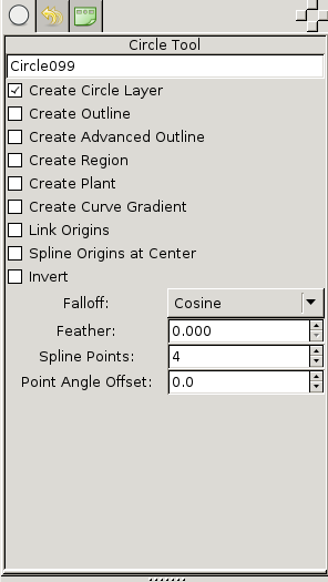
The intend to introduce buttons (icons) instead of labels (texts) for the layer types created is to save screen space. More job is still need to take for the UI layout of Options. Current version is not that logical and intuitive. For example, Falloff should be connecting to Feather, when Feather is set to Zero, the Falloff should be inactive. And The layout should look like
Feather [ 0.20 ]
  Falloff  [ Cosine V ]
So a user can easily understand Falloff Determines the falloff function for the feather. If we think further , Feather should be activated only when user enable Circle Layer creation option.
There are some other important things we should define to build a flexible and beautiful UI:
- The mini screen size of the widget (Width and Height), Tool Options Panel, in this case.
- The order/sequence of these options
- Is it always good to expose all features directly to user? (I know it is hard to remove a feature once it was added into the code base, both from user or developer )
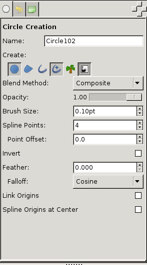
According to the discussion, the mockup is improved, please take a look at the image file in the first post.
Changes:
- Rearrange UI layout
- Add UI Logic
- Rename Point Angle Offset to Point Offset and add an unit symbol to its value
very nice …
“.” are displayed instead of “,” in float values…this not the actual situation 
This is an enhancement i will post soon :
“great number input box” :
- do not accept illegal char (alpha ones … )
- allow calculation (2+2 = 4)
- “.” —> “,”
- other ?
This is not your actual situation… because you have your locale set to “,” instead of default “.”
-G
Genete you unmask me … yes i’m LC_NUMERIC=“fr_FR.UTF-8”
… ouf, this is not conflicting with the enhancement i want to post ![]()
but it should be cleaner than i thought !
- “.” == “,” && “,” == “.” … or at least, take a look inside what gimp (for example) do .
Changes:
- Define 6 options categories. For some tools, Gradient for example, has not all of these 6 categories of course, it doesn’t matter. All the tools’ options will be following this order and being grouped.
wow… does synfig will be a user friendly app" someday?
Today,I take my annual leave and was expecting to have a rest from hard work recently.
The bad news is that I was still seating in front of my computer whole day  but there is a good news as following
  yes, the prototype is almost done.
Looks very nice. ![]()
I always though the tool options panel could use some improvements.
Maybe other tools can also make better use of this panel too (some have no options at all).
IMO, better more flexible tools would help a lot with synfig usability.
Hello…
I was thinking, Feather gives the same result that using “bluring” in inkscape. And somehow, I believe that it’s also related with the blur effects in Gimp. So… I think We are talking of the same concept.
I see that there is a special categories of layers called “Blurs”, which gives almost the same results that the feather parameter.
what I’m trying to say is:
- I vote for change the text “feather” for “blur”. And Fall-off for “type of blur” or “bluring method” or something similar.
From what I understand, Blur and Feather are two different features. Regarding other graphics apps, gimp/inkscape have feather command as well as blur filters.
In Inkscape, I don’t see that feather command.
On Synfig, I don’t see the visual difference between feather and bluring. If some one could explain these, then It may be neccesary that differentiation.
Feather never place or modify pixels outside the shape boundaries meanwhile blur is normally 50% inside and 50% outside. Oddly in Synfig, feather is behaving like blur.
-G